


8 Picture Hanging Designs for Stunning Walls
A blank wall can make a room feel unfinished, even when the artwork is ready and the frames are leaning nearby. The hesitation is understandable: a piece hung too high, a row that drifts off level, or a gallery wall with uneven gaps can make good art feel out of place. The right picture hanging designs solve more than the problem of empty wall space. They help artwork relate to furniture, guide the eye through a room, and make a collection feel intentional.
This guide covers eight layouts, from a close-set salon wall to a clean grid and a flexible picture rail. Each design pairs practical spacing and placement rules with examples for homes and offices, plus ways to handle lighting, framing, and wall conditions. A useful starting point for many rooms is the 57-inch center rule: place the visual center of the artwork or grouping about 57 inches from the floor, then adjust for furniture, sightlines, and accessibility. For a careful installation, use these tips for measuring and positioning pictures before making holes.
The measurements here are working guidelines, not rigid formulas. Mock up the arrangement with paper templates, check it from the doorway and seated positions, and make sure the layout suits the people who use the space.
1. Salon-Style Gallery Wall
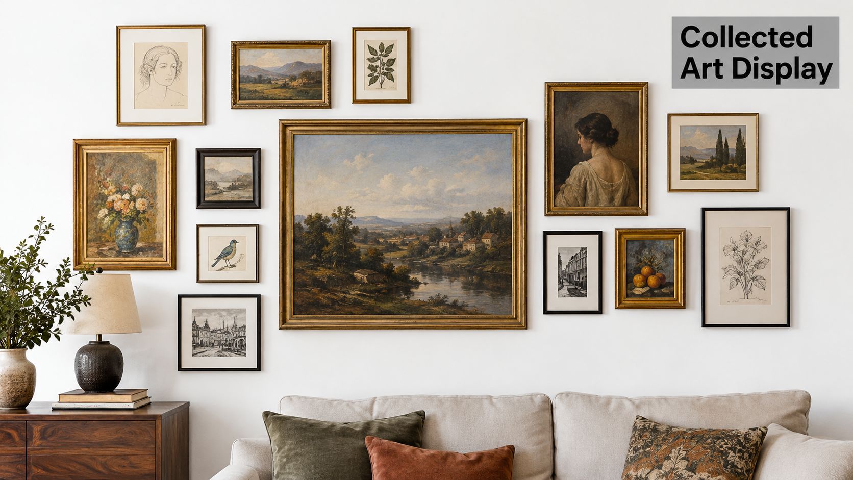
A salon-style wall brings many frames together in a close, layered composition. The format has deep roots in Western exhibition history: the French Royal Academy of Painting and Sculpture used available wall space to show large numbers of works in Paris in 1667, and the exhibitions held in the Louvre's Salon Carré from 1725 gave the format its name. Paintings often filled the wall from floor to ceiling, with placement signaling hierarchy as well as making room for more art. The salon-hanging history and installation context offer a useful reminder for modern rooms: density needs an organizing principle.
In a living room, this style can turn the wall above a sofa into a collection rather than a single focal point. Start with a substantial anchor piece near the visual center, then build outward with varied sizes, orientations, and subjects. Keep gaps roughly 2 to 3 inches between frames, and place the grouping's center around 57 to 60 inches from the floor. Exact-size paper templates make it much easier to test the outline before drilling.
Practical rule: Let the largest work establish the composition, then balance its visual weight with smaller pieces. Don't let every frame compete for the same attention.
The trade-off is visual abundance versus individual legibility. Too many frames, dark borders, or highly varied subjects can make a wall feel crowded, especially in a dim room. Mix lighter and darker frames, leave breathing room around the anchor, and consider a mirror to reflect ambient light. In an office reception area, a salon arrangement can communicate a broad collection or company history, but keep the most important works easy to find at a glance. For professional layout and installation help, see gallery wall installation planning, or browse the painting project gallery.
2. Grid Gallery Wall
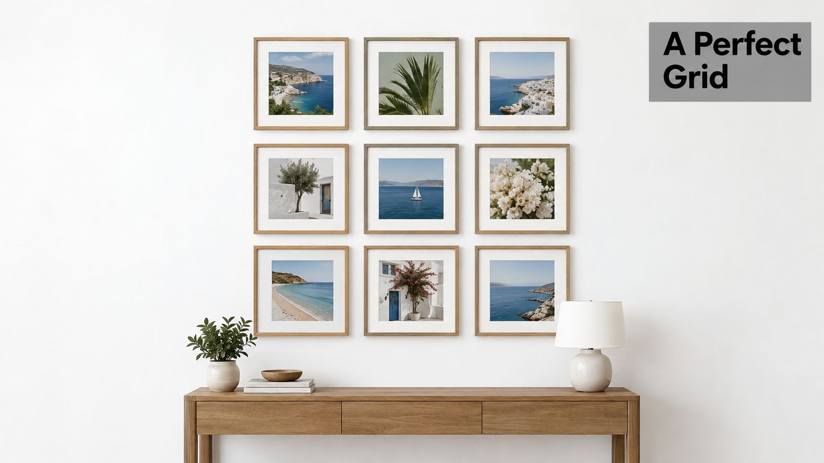
A grid gives a collection a clear rhythm. Matching or closely related frames align in rows and columns, making the layout a natural fit for a contemporary home office, a corporate lobby, or a set of photographs that belong together. Unlike a salon wall, a grid doesn't hide variation through density. It makes every gap and alignment visible, so careful measuring matters.
Begin by choosing the number of rows and columns, then measure the full outside dimensions of the arrangement. Mark the grid's outer edges on the wall with low-tack tape, and work inward from a reference line. Keep the gap consistent, often 2 to 3 inches for compact frames; wider gaps may suit larger pieces or a broad wall. Use a level or laser to establish the first row, then align the remaining frames to that line instead of measuring each one independently.
Keep the geometry crisp
In a home, a grid of family photographs can sit above a console or along a stair landing. In a workplace, repeated prints or photographs can bring order to a reception area without making the wall feel overly formal. Center the full group over the furniture, or center it on the usable wall area if there's no furniture beneath it.
Frames don't have to be identical, but the layout benefits from restraint. Matching finishes create a unified appearance; if you want variation, limit it to a small, deliberate palette. A grid can look stiff when the artwork is unrelated, while mismatched frame widths can weaken its clean edges. Check the composition in daylight and under evening lighting. Glass can reflect windows or ceiling fixtures, so change the fixture angle or use low-reflection glazing when glare distracts from the images.
3. Asymmetrical Organic Gallery Wall
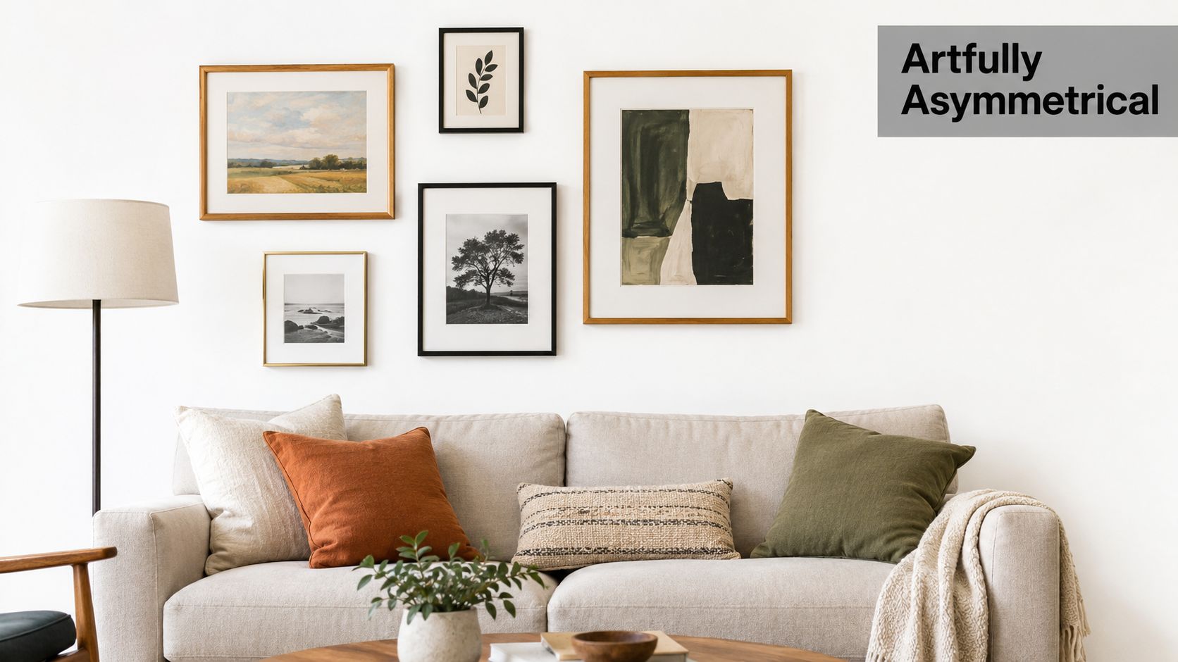
An organic arrangement looks relaxed because it balances visual weight, not matching positions. A large print can anchor the grouping while small photographs, a mirror, or a compact object fill the surrounding space. This approach works well in an eclectic living room, a boutique hotel lounge, or a landing where a strict grid would feel too rigid.
Place the largest piece first, usually near the area you want viewers to notice. Then add smaller works around it, shifting between portrait and horizontal orientations to make the composition feel collected rather than mechanical. The outer edge can be irregular, but the gaps within a cluster should still feel intentional. Keep spacing consistent where pieces sit close together, and distribute dark frames or visually heavy images across the grouping so one side doesn't dominate.
A floor layout is especially useful here. Arrange the frames on kraft paper or a clean floor, photograph the result, and adjust before transferring the positions to the wall. Templates help preserve the composition as you move pieces into place. For a sofa wall, keep the overall cluster visually connected to the furniture instead of letting it float high above the seating. On a stair landing, shape the grouping to the available wall area and preserve a clear path through the space.
The main risk is a layout that appears accidental rather than informal. A shared color, subject, frame material, or finish can tie varied pieces together. A boutique hotel might combine local prints and a small mirror in a loose cluster to create a residential mood; at home, family photographs and collected art can feel cohesive when they share a restrained palette. Check the wall from the room entrance and from the main seat. If one side feels too heavy, move a dark frame or add a lighter, smaller work to rebalance it.
4. Symmetrical Axial Arrangement
Symmetry brings order to a wall, especially when the room already has a strong center such as a fireplace, console, reception desk, or doorway. Mark the true centerline of the furniture or architectural feature first. Then measure outward from that line so paired works sit at matching distances, rather than estimating each position from the nearest wall edge.
In a formal dining room, matching paintings can flank a mirror above a sideboard. In an office lobby, one larger work centered over the reception desk can establish the axis, with smaller pieces arranged in balanced pairs. A central anchor makes the hierarchy clear; matching frames reinforce the formality, while artwork can vary slightly in subject or color if the sizes and placements remain balanced.
A symmetrical arrangement only looks precise when its reference point is correct. Measure from the center of the furniture or feature, not from a wall that may not be square.
Keep the paired frames' centers aligned, or use a consistent bottom edge if the art varies in height. Choose the center height with the room's viewing position in mind, and check that the lower edge clears lamps, chair backs, and objects on a console. The 57-inch center rule works as a starting point for many walls, but a work above a mantel or desk may need to sit closer to its supporting feature to read as one composition.
This layout can feel stiff if every element is matched too exactly. Use it where the architecture supports formality, and soften it with varied artwork or a warmer frame finish if the room feels severe. In a hotel entry, symmetry can make the arrival point easy to understand. In a relaxed family room, the same treatment may feel overly formal unless the surrounding furniture and decor share its structure.
5. Horizontal Linear Art Band
A horizontal band is a single row of art with a shared alignment. It suits wide walls above sofas, beds, and consoles, as well as office corridors where a series of related images can guide people along the space. The line may follow the center of each frame or the top edges, but choose one reference and keep it consistent.
For larger works, leave 3 to 6 inches between frames. Measure the total width, including the spaces, and compare it with the furniture below. A row that nearly matches the furniture's width often feels connected; one that stretches far beyond it can make the furniture seem undersized. Without furniture, center the band's overall visual mass around 57 to 60 inches from the floor.
A row that supports the room
A homeowner might hang a botanical series above a sofa, using similar frames to keep the row calm while allowing the prints to differ. In a corporate hallway, a sequence of related photographs can make a long passage feel considered rather than empty. Use a laser line or a level to mark the chosen alignment before hanging, particularly when the frames have different outside dimensions.
The trade-off is clarity versus repetition. A consistent row makes each image easy to compare, but it can look monotonous if every print, frame, and mat is identical without a clear reason. Vary the artwork while keeping the framing related, or introduce subtle differences in frame depth while preserving the line. Check reflected light across the entire row: a window or ceiling fixture can catch one frame differently from the others. Adjust the fixture or viewing angle, and avoid placing a bright light where it creates a distracting glare band across glass.
6. Staircase Diagonal Hanging
A staircase arrangement follows the slope of the stairs, giving a tall or narrow wall a clear direction. It can work in a two-story home foyer, a residential stairwell, or an office stair corridor where a related series leads the eye upward. The challenge is not merely making the frames appear diagonal. Their relationship to the stair's pitch and the people using the stairs has to feel consistent.
Start by measuring the stair slope and marking a diagonal reference line with a laser or careful level measurements. Then position the frames so the distance from the stair nosing to each frame remains visually consistent. The bottom work needs to clear foot traffic and avoid creating a hazard at the landing; the upper works should remain visible without forcing viewers to crane their necks.
A repeating frame style can make the climb feel orderly, while varied images keep it from reading like a rigid office display. For a home, a sequence of family photographs or travel prints can follow the rise. In an office or hotel, framed works with a shared subject or palette can make an otherwise overlooked stairwell feel connected to the rest of the interior.
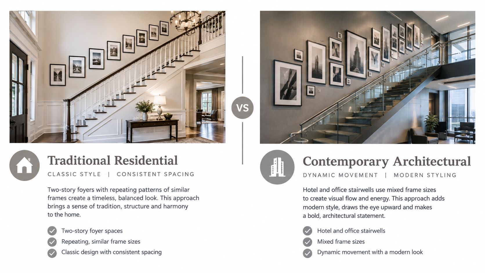
Before drilling, identify the wall construction and choose hardware suited to the frame weight and wall material. Don't assume a stairwell wall is an easy surface to work on: height, access, and the angle of the stairs can make installation more demanding than a standard room. A professional installation can help with high placement and consistent alignment.
For a visual reference to different stairwell treatments, view this staircase gallery installation:
7. Picture Rail and Hanging Rail System
A picture rail lets you hang art from a track using hooks and cables rather than adding a new nail for every frame. Older homes may have original picture rails, while modern rail systems can make a collection easier to rearrange. This can be especially useful in a home gallery, a plaster-walled residence, or a workplace that changes displays over time.
First check the rail's weight rating and confirm that it's attached to studs or appropriate anchors. Match the cable, hook, and frame hardware to the piece being hung, and use a level to keep the rail straight. A rail that looks subtly crooked can make every frame below it appear misaligned. Adjust cable lengths to place each artwork at the intended height, with the piece's center near 57 to 60 inches where room conditions allow.
Don't skip the load check. A hanging system only works safely when the rail, attachments, cables, and frame hardware are all suited to the artwork.
In a historic home with a picture rail, cables can spare plaster walls from repeated new holes. In an office gallery, a track system lets staff update a photographic series or rotate artwork without replanning every fastener. The trade-off is visual: visible cables may suit a gallery setting but feel distracting in a quiet living room. Choose a finish that blends into the wall or treat the rail as an intentional architectural detail.
Plan cable drops before hanging. If frames vary in height, the top edges may naturally differ, so choose a consistent centerline or another alignment rule to keep the overall display composed. For help selecting and planning a system, see art hanging systems for flexible displays, and use this guide to find the right picture placement.
8. Mixed-Media Wall Composition
A mixed-media wall combines framed art with mirrors, textiles, shelves, or sculptural objects. The result has depth and texture that a wall of flat frames can't provide, making it a strong choice for a luxury living room, hotel lounge, or commercial lobby where the wall is part of the interior design.
Lay out every element before installation, including the depth of shelves and objects that project from the wall. A paper template can show where frames sit, but mark the outlines of three-dimensional pieces separately so you can judge their reach and visual weight. Check the wall structure before mounting shelves or sculpture, particularly on drywall or plaster. Heavy items need suitable support, and their fixings should match both the object and the wall.
Balance reflection, texture, and weight
A mirror can bounce ambient light into a dim area, but it can also reflect a window, lamp, or bright ceiling fixture directly into a viewer's eyes. Test its angle from the positions where people sit or walk. In a hotel lobby, a sculptural object and mirror can break up a large frame arrangement; in a living room, textiles and framed prints can bring warmth without making the display feel like a showroom.
Place heavier-looking or physically substantial elements lower, with lighter pieces higher, and establish one clear focal point. Avoid lining up every frame edge when the objects have different depths. Instead, use repeated colors, materials, or shapes to connect the pieces. Lighting should highlight the focal work without creating glare on glass or a hard shadow behind sculpture. Dimmable, adjustable fixtures make it easier to tune the display for changing daylight and evening use.
The main risk is letting every object compete. Leave visible breathing room, and keep shelves from projecting into circulation paths. For coordinated planning of framed works and objects, see mixed-media art installation planning.
8 Picture Hanging Designs Compared
Arrangement | Implementation Complexity | Resource Requirements | Expected Outcome | Ideal Use Cases | Key Advantage |
|---|---|---|---|---|---|
Salon-Style Gallery Wall | High; requires careful layout and spacing | Many varied frames, multiple fasteners, templates | Dense, bold display with limited emphasis on individual pieces | Living rooms, stairwells, collections of varied art | Displays many works in one cohesive focal point |
Grid Gallery Wall | Moderate; precise measuring and alignment required | Matching frames, level or laser, consistent hardware | Clean, orderly, geometric display | Modern homes, offices, photo or print series | Easy to plan, expand, and maintain |
Asymmetrical Organic Gallery Wall | Moderate to high; needs visual balancing | Varied frames and art; templates or floor layout | Relaxed, personal arrangement with an informal flow | Homes, lounges, collections built over time | Accommodates varied pieces and can grow gradually |
Symmetrical Axial Arrangement | Moderate; requires accurate measurements | Matching or related pieces, measuring tools, consistent hardware | Formal, balanced display centered on an axis | Entryways, formal rooms, lobbies | Creates a clear sense of order and balance |
Horizontal Linear Art Band | Low to moderate; align pieces to one reference line | Related artwork, level, evenly spaced hardware | Elongated display that reinforces a room's horizontal lines | Above sofas or beds, corridors, artwork series | Simple installation and effective use of wide walls |
Staircase Diagonal Hanging | High; requires measuring the stair slope and safe placement | Varied or repeating frames, level or laser, secure hardware | Dynamic display that follows the staircase | Stairwells, foyers, narrow vertical walls | Turns a transitional space into a visual feature |
Picture Rail and Hanging Rail System | Moderate to high; rail installation is needed | Rail, adjustable cables or hooks, suitable anchors | Flexible display that can be rearranged with minimal wall damage | Galleries, rentals, historic homes, rotating collections | Enables changes without adding new wall holes |
Mixed-Media Wall Composition | High; requires planning and structural checks | Framed art, mirrors, objects, shelves, secure supports, lighting | Layered display with varied depth and texture | Luxury homes, hospitality spaces, lobbies | Combines art, reflection, and three-dimensional interest |
Get Museum-Level Walls at Home or Work
A good wall layout starts with the room, not the frame. Look at the available wall width, the furniture beneath it, the path people take through the space, and where the light falls at different times of day. A close-set salon arrangement suits a broad collection and a bold focal wall; a grid works when repeated alignment is the point; a linear band can support a long sofa or corridor without taking over. Choose the format that helps the art and the room make sense together.
Use the 57-inch center rule as a starting point, not a command. A grouping above a sofa may need to sit lower to feel connected to the seating, while a stairwell or public space needs clearances that protect people moving through it. Artwork should also remain readable for the people who use the room. In accessible spaces, consider reach, mobility-device clearance, protruding objects, head clearance, glare, and shadows as part of the layout rather than as later fixes.
Spacing is what makes a design feel deliberate. Keep gaps consistent within a grid or cluster, and measure the full footprint before you hang a row above furniture. Templates are inexpensive insurance against avoidable holes, especially when the arrangement includes frames of different sizes. Check the result from standing and seated positions, and view glass from several angles to spot reflections before fixing the final light position.
For heavy pieces, high walls, or a full office installation, professional help can make the difference between a pleasing layout and a risky one. Colorado Art Services provides residential and commercial art installation, including layout and design for framed artwork, mirrors, and sculpture across the Denver Metro and Front Range. The team can help plan the arrangement, account for wall conditions and lighting, and install the work safely and level.
Colorado Art Services can plan and install picture hanging designs for homes, offices, and collections, from precise grids to mixed-media walls and heavy pieces. If you're ready to turn a blank wall into a considered display, visit Colorado Art Services to discuss your installation.
Comments