


8 Gallery Wall Art Layouts to Inspire Your Space
A gallery wall shouldn't begin with a search for empty wall space. It should begin with a decision about how the wall needs to function. The strongest gallery wall art arrangements respond to the room's proportions, the furniture below them, the collection's visual weight, the viewing path, and the kind of attention you want each piece to receive.
Before choosing nails, define the focal point. Test the composition on the floor or in a scale drawing, preserve intentional spacing, check the light throughout the day, assess the wall's strength, then install and level each piece. A compact grid rewards precision, while a salon arrangement depends on distributed weight and an intuitive rhythm. Mixed-media and large-format displays add another layer, because hardware, frame depth, wall type, and sightlines can matter as much as appearance.
The eight layouts below treat a gallery wall as an installation system rather than a decorative formula. Colorado Art Services can help with precise residential, commercial, gallery, heavy-piece, and mixed-media installations when the layout or hardware calls for professional expertise.
1. Grid Layout Gallery Wall
A grid is the most controlled gallery wall format. Equal-sized frames sit in consistent rows and columns, producing a calm visual field that works especially well when the artwork itself needs to look unified. Matching black frames and monochrome photography can give a Boulder living room a contemporary edge, while a Denver technology office might use a repeated grid of brand photography to create a consistent lobby experience.
The strength of a grid is also its weakness. Small errors become obvious because the eye expects alignment. A frame that sits slightly high, a gap that changes from one row to the next, or a wall that isn't perfectly level can make the entire arrangement feel unfinished.
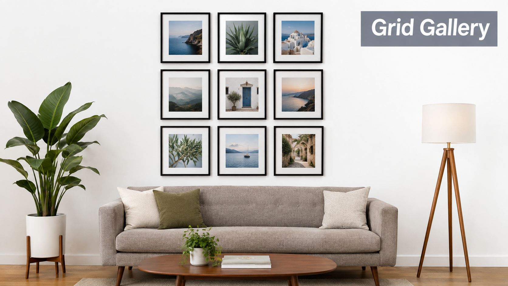
Plan the whole unit first
Lay every frame on the floor and establish the outside edges before measuring the wall. Photograph that arrangement from directly in front, then use painter's tape to reproduce the frame positions on the wall. Starting at the center and moving outward keeps small measurement variations from accumulating at one edge.
For residential placement, treat the arrangement as a single visual unit. A museum-oriented benchmark places the center of the overall composition at about 58 inches from the floor, according to Purdue's Rueff Galleries hanging guide. Above a sofa or credenza, the furniture relationship may require adjustment, but the group should still read as one balanced object.
Use a measuring tape or spacer blocks to keep gaps consistent. Mark nail locations with a level before drilling, and match the hardware to the frame and wall rather than relying on a single universal hook. For a detailed installation approach, see Colorado Art Services' gallery wall installation guidance.
2. Salon Style Gallery Wall
A salon wall replaces geometric repetition with controlled irregularity. Different frame sizes, finishes, orientations, and media create a collected effect, but the arrangement still needs a visual structure. A Denver home might combine Colorado scenery prints with family photographs, while an Aspen collector's residence could place a small drawing beside a larger painting, textile, or mirror.
This layout succeeds when the eye can move through the wall without finding one corner that feels overloaded. Distribute dark frames, saturated colors, and large formats across the composition. If every heavy piece sits on one side, the wall will lean visually even if its outer edges appear balanced.
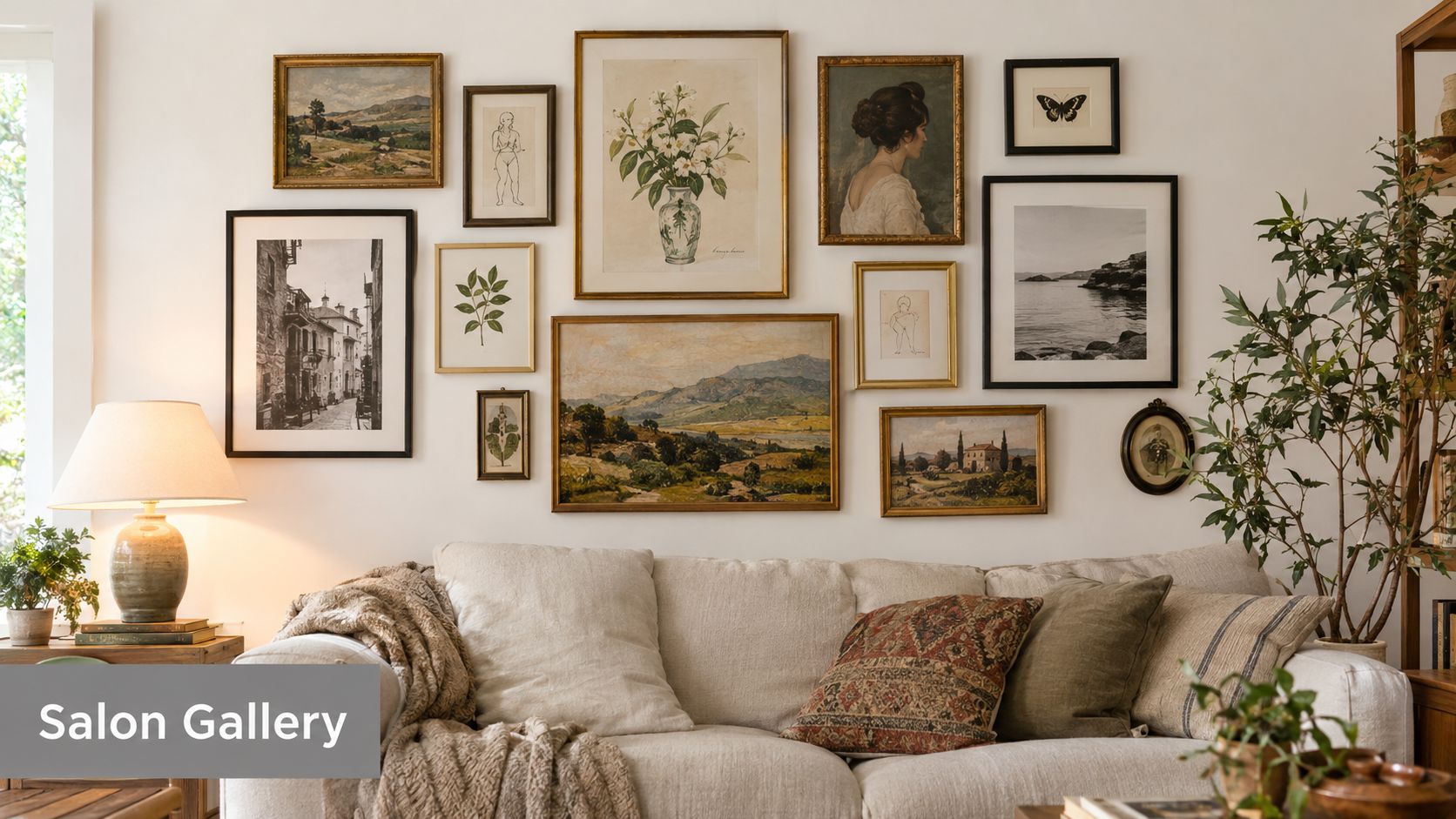
Use a focal point, not a rigid center
Begin with the piece that carries the most meaning or visual authority. Build outward from it, placing related colors, materials, or subjects on alternating sides. The aim isn't perfect symmetry. It's an arrangement where the large and small pieces support one another.
Lay all the work on the floor, then photograph several alternatives. Step back between changes. A salon wall often looks persuasive up close but becomes top-heavy from the room's main doorway.
Practical rule: Keep the gaps intentional even when the frame sizes change. Residential guidance commonly recommends 2 to 3 inches between frames, with tighter spacing for formal groupings and wider gaps for looser salon compositions, as outlined by Austin Art Gallery's placement guide.
Mixed media can make the wall more personal, but variety needs a unifying thread. Repeat a frame color, wood tone, mat color, or subject family. A combination of gold, black, natural wood, and white frames can work when those finishes are distributed rather than clustered. The salon format is ideal for a home that needs narrative, but it can look accidental if the collection has no shared visual language.
3. Linear Horizontal Gallery Wall
A horizontal line creates movement across the wall with relatively little visual noise. It works above a sofa, console, bed, or dining sideboard, and it can guide visitors through a hallway or office corridor. Six black-framed photographs in a single line above a contemporary Denver sofa will feel restrained and architectural. A sequence of milestone photographs can perform the same role along an Aurora office hallway.
The arrangement depends on a reliable center line. Measure the center of each frame, not the top edge, and set those centers at the same height. This matters when frames have different dimensions or hanging hardware positioned at different points on the back.
Let the wall and furniture set the width
Measure the total intended span, then find the wall's center before placing the first piece. Above furniture, the grouping should relate to the furniture's width rather than float as an unrelated strip. Guidance for residential gallery walls generally places the grouping at about two-thirds of the furniture width and approximately 6 to 10 inches above a sofa or credenza, according to Austin Art Gallery's hanging recommendations.
Keep the spaces between pieces consistent, usually around 2 to 3 inches for a cohesive line. On a very long wall, a single uninterrupted sequence can become repetitive. Dividing the display into smaller visual groups creates pauses, but the larger gaps must look deliberate rather than like missing artwork.
Use frames with similar depth when the line is intended to feel polished and contemporary. Different depths can introduce shadows and irregularity, but they also make alignment more difficult. Painter's tape can mark the lower and upper edges before any hardware goes in, especially in a hallway where the arrangement will be viewed obliquely as people move past it.
4. Vertical Column Gallery Wall
A vertical column makes a narrow wall useful and draws attention upward. It suits stairwells, tall entryways, narrow hallways, and architectural spaces where a horizontal arrangement would feel cramped. In a Denver stairwell, a column of mountain photography can follow the vertical energy of the space. In a Vail residence, smaller images can lead the eye toward a high ceiling without competing with the room's main furniture.
The column needs a strong vertical guide. Mark a centerline with painter's tape, then build the arrangement around that reference. When the wall is narrow, even a modest shift can make the column appear off-center from the doorway or stair landing.
Stabilize the visual weight
Place the larger frames lower when possible and lighter pieces higher. This isn't an absolute rule, but it generally gives the composition a grounded base. Keep the internal gaps consistent, often 2 to 3 inches, and check the arrangement from every important approach angle, not only from directly in front.
A single column can feel elegant but repetitive if every frame has the same orientation. Introduce controlled variation through image subject, mat size, or frame texture rather than changing every variable at once. Multiple columns need equal horizontal separation and a shared baseline or center structure.
Leave breathing room at the top. A tall display pressed too close to the ceiling can make the room feel compressed, while excessive space above it can disconnect the art from the architecture. The correct position depends on the wall, ceiling, and viewing path, so tape the full arrangement before drilling.
Traffic flow is a practical concern here. A protruding frame at shoulder height beside a stair or hallway can become a collision point. Use low-profile hardware where appropriate, secure every piece, and avoid placing fragile or deep objects where passing bodies and doors can reach them.
5. Mixed Media and 3D Gallery Wall
A mixed-media wall turns a flat display into a layered installation. Framed prints can sit beside mirrors, woven textiles, ceramics, sculptural objects, floating shelves, or other pieces that project from the wall. A Denver collector might combine paintings with regional textiles, while an Aspen residence could integrate shelving, sculpture, and framed travel materials into one evolving composition.
This format succeeds when material variety adds depth without destroying hierarchy. A reflective mirror can open a dark corner, but it may also bounce glare into a seating area. A ceramic object can supply texture, yet its weight and mounting surface require more planning than a paper print.
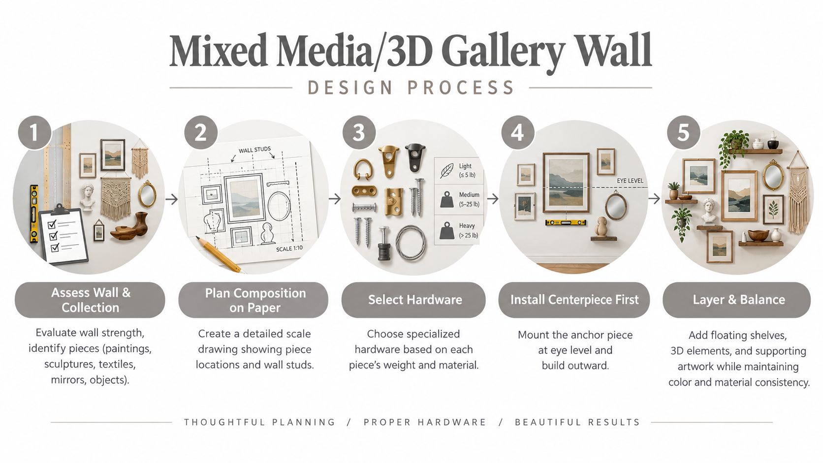
Draw the wall before you touch it
Create a scale drawing that records each object's width, height, depth, and approximate weight. Mark studs, electrical concerns, wall transitions, and the position of furniture. Then assess the installation from the main doorway, seated positions, and any nearby circulation path.
The hardest mixed-media problems are usually operational, not decorative. Wall condition, secure mounting, frame depth, and changing sightlines determine whether the composition remains safe and convincing.
Use hardware designed for the specific object and wall type. Shelves need secure attachment, textiles may require support that doesn't distort the fabric, and sculptures can place unusual stress on a mounting point. Colorado Art Services' mixed-media installation service is relevant when the display combines heavy, fragile, or three-dimensional work.
The lighting plan should come before installation. Mirrors need controlled reflections, while textured pieces benefit from grazing light that reveals their surface without creating harsh shadows. The following video can help visualize the planning sequence.
Avoid placing the most visually complex pieces beside one another. Give a sculptural object room to register, and use calmer framed works to create pauses. If the wall includes valuable or irreplaceable pieces, professional assessment is appropriate, particularly where wall construction or load paths are uncertain.
6. Thematic and Color-Blocked Gallery Wall
A thematic wall starts with a relationship between the pieces. The organizing principle might be Colorado scenery, family history, black-and-white photography, a particular artist, a medium, or a limited color family. In a Boulder home, local artists can share a restrained palette. In an office, blue and gray imagery can reinforce an existing environment without turning the display into a collection of unrelated posters.
Choose the theme before choosing frames. A mood board, even a simple one assembled from phone photographs, reveals whether the collection has enough connection to feel intentional. The theme doesn't need to be literal. Similar contrast, warmth, line quality, or subject scale can bind very different works together.
Control unity without flattening variety
A limited palette creates coherence, but identical frames aren't required. Keep the frame finish related while allowing the artwork to vary in size and technique. A family wall can combine formal photographs, children's art, and milestone pieces if the mats, frame colors, or spacing provide a common structure.
Don't force every piece to match the wall's paint color. That approach can make the display disappear. Instead, identify the room's existing colors and select artwork that either repeats them selectively or supplies a considered contrast.
Negative space protects the theme from becoming visual noise. Leave enough room around the grouping for the viewer to understand its boundaries, and plan a future addition area if the collection is likely to grow. Adding new work should strengthen the organizing principle rather than fill whichever gap happens to remain.
This layout works particularly well for institutions, offices, and collectors with a clear story to tell. It works less well when the theme is imposed after purchase and the pieces have no meaningful connection. In that situation, a salon arrangement may be more honest and more visually successful.
7. Large-Format and Statement Piece Gallery Wall
A statement wall succeeds through controlled scale, not merely through the largest artwork available. One substantial work can anchor a room on its own, or smaller pieces can support it without competing for attention. A contemporary Denver loft, a Vail mountain photograph, or an Aspen office heritage image can each suit this installation system.
Judge the anchor against the wall, surrounding architecture, and viewing distance. A canvas narrower than the sofa may read as a placeholder, while one spanning the wall needs clearance from door frames, corners, and adjacent features. Large work also needs enough surrounding space to remain legible rather than appearing wedged into the room.
Give the anchor room to work
Center the principal piece on the wall or the furniture it relates to, then test whether supporting works improve the balance. Smaller pieces should reinforce its scale, color, or subject without forming a second focal point. Measured gaps can create rhythm, while generous negative space often gives a single work greater authority.
Keep the artwork's center near the viewer's natural sightline, adjusting for the room's use and furniture height. A bedroom, stair landing, and seated living room require different placements. Mark the proposed position with painter's tape before drilling, then view it from the main approach and from the seating area.
Weight and wall structure determine the mounting method. Large-format work may require studs, rated anchors, cleats, or multiple attachment points. Confirm the frame's weight, the wall condition, and the hardware rating rather than assuming a standard picture hook is adequate. Colorado Art Services' guidance on hanging large artwork addresses planning concerns for substantial pieces and high placements.
Lighting completes the installation. Aim light at the artwork while controlling glare, heat exposure, and shadows from the frame. Track, picture, or adjustable recessed lighting can work, but each should be tested from the viewer's position. Check the wall in daylight and after dark, because reflections that are invisible in daytime can dominate a darker room. For hanging height, Austin Art Gallery's hanging advice offers residential guidance, while the Purdue museum hanging guide provides a museum-oriented reference.
8. Floating Shelf and Art Combination Gallery Wall
Floating shelves add a functional layer to gallery wall art. They can hold books, small sculptures, framed photographs, plants, ceramics, and objects collected during travel, while wall-mounted pieces establish the larger visual structure. A Denver home office might pair shelves of books and personal objects with framed prints. A Castle Rock living room could combine shelves, family photographs, and decorative pieces without requiring every item to be permanently mounted.
The shelf system should be designed before the artwork is finalized. Shelves create horizontal lines that can either stabilize the display or compete with the frame arrangement. Decide whether they form the base, interrupt the composition, or act as a separate visual band.
Mount the system before styling it
Mark shelf locations, stud positions, and the intended edges of the full display. Keep the shelves level and use hardware appropriate to their expected load. A shelf that holds books and ceramics needs a different installation assumption from one holding only lightweight prints.
A useful styling balance is roughly 70% art or functional contents and 30% open breathing room, as a practical design guideline rather than a fixed rule. Vary the heights of books, objects, and frames, but repeat materials or colors so the display doesn't become a miscellaneous storage area.
A shelf is part of the mounting system, not just a styling surface. Secure it first, then decide what belongs on it.
Group objects with purpose. A tall book stack can balance a low ceramic form, while a small plant can soften a hard frame edge. Avoid placing the heaviest visual objects at every end, and leave enough clearance for people to use the room without brushing against protruding items.
This layout works well in offices and homes that need both display and storage. It requires more maintenance than a fixed frame grid, because objects move, collect dust, and can alter the balance over time. For valuable objects, high shelves, or installations on uncertain walls, plan the load and anchoring before styling the shelves.
8 Gallery Wall Layouts Compared
Style | Implementation complexity | Resource requirements | Expected outcome | Ideal use cases | Key advantages |
|---|---|---|---|---|---|
Grid Layout Gallery Wall | Low–Moderate, precise measurements and leveling | Matching frames, templates, level, measuring tools | Clean, structured, professional look | Modern homes, offices, commercial lobbies | Scalable, easy to plan, consistent symmetry |
Salon Style (Eclectic) Gallery Wall | Moderate–High, requires design sense and iteration | Mixed frames/art, time for floor layout, varied hanging hardware | Warm, collected, highly personalized display | Art collectors, eclectic interiors, galleries | Flexible, forgiving, strong storytelling potential |
Linear/Horizontal Gallery Wall | Low, simple alignment and spacing | Similar‑sized frames, measuring tape, level | Horizontal flow and minimalist sophistication | Above sofas, hallways, narrow long walls | Creates movement, easy to execute, furniture-friendly |
Vertical Column Gallery Wall | Low–Moderate, vertical alignment important | Level line, varied frame sizes, basic hardware | Emphasizes height and upward movement | Stairwells, narrow walls, high‑ceiling spaces | Highlights verticality, strong focal lift in tight widths |
Mixed Media/3D Gallery Wall | High, complex planning and expert installation | Specialized hardware, structural assessment, professional installer | Layered, textured, gallery‑quality installation | Luxury residences, galleries, collectors with 3D pieces | Adds depth and texture; showcases diverse mediums |
Thematic/Color‑Blocked Gallery Wall | Moderate, needs curatorial vision and restraint | Curated artwork with unified palette, frames, planning time | Cohesive narrative and harmonious color story | Brand spaces, themed rooms, curated collections | Cohesion, clear direction, easier sourcing of pieces |
Large‑Format/Statement Piece Gallery Wall | Moderate–High, placement and support critical | Oversized artwork, heavy‑duty anchors, professional install, lighting | Dramatic focal point and high visual impact | Minimalist homes, lobbies, rooms needing a centerpiece | Immediate impact, elevates space, fewer elements needed |
Floating Shelf + Art Combination Gallery Wall | Moderate, mounting and styling skills required | Floating shelves, stud anchors, mixed objects, styling time | Functional, layered display with depth | Home offices, living rooms, display + storage areas | Functional and flexible, easy to update, displays 3D items |
Turn Inspiration Into a Wall-Ready Plan
The right arrangement depends on the wall more than on the trend. Choose a grid when the collection has repeated formats and the room benefits from order. Choose a salon wall when the pieces differ in size, origin, and medium but share personal meaning. A horizontal line suits furniture and corridors, while a vertical column works with narrow walls, staircases, and tall architecture.
A mixed-media wall or shelf combination needs more than a pleasing floor layout. Depth, support, object weight, wall construction, and viewing angles all affect the finished installation. Large-format work needs similar attention, because the anchor piece has enough visual and physical presence to expose weak proportions or inadequate hardware.
Use this planning sequence before making holes:
Choose the arrangement: Match the layout to the wall proportions, collection size, interior style, furniture, and expected viewing distance.
Measure every piece: Record the outside frame dimensions, hanging points, depth, and approximate weight. Include shelves, mirrors, textiles, and sculpture.
Create a mockup: Build the arrangement on the floor or use taped rectangles on the wall. Photograph the result from the room's main viewing positions.
Confirm spacing and sightlines: Treat the group as one visual unit. Residential guidance commonly places frames 2 to 3 inches apart, while more formal grids may use tighter gaps, according to Austin Art Gallery's spacing guidance.
Plan the lighting: Check daylight, evening light, reflections, glare, shadows, and the position of existing fixtures before finalizing the layout.
Identify studs and hardware: Confirm wall type and use hardware rated for each piece. A plaster, masonry, or hollow wall may require a different approach from a stud-backed partition.
Install from the focal point outward: Hang the most important or central element first, then work outward while checking level, spacing, and the overall balance.
A grid rewards precision. A salon wall rewards balance rather than symmetry. Statement and mixed-media displays require structural planning, and shelves require secure mounting before they become decorative surfaces. The most attractive layout can still fail if the wall cannot carry the load, the hardware doesn't match the piece, or the lighting makes the artwork difficult to see.
Photograph your proposed arrangement and review it at full-room distance before installation. If the project involves heavy or valuable work, high placement, a commercial setting, a gallery layout, or many pieces that must align precisely, contact Colorado Art Services for museum-quality placement and secure handling.
Colorado Art Services provides residential and commercial gallery wall planning, precise placement, and installation for framed art, mirrors, sculpture, large-format displays, and mixed-media arrangements. Visit Colorado Art Services to discuss your wall, collection, hardware, and installation requirements with a professional team serving the Denver Metro area and Front Range communities.
Comments