


Gallery Layout Design: Flow, Spacing and Sightlines
The most popular advice about gallery walls is also the most incomplete: measure the gaps, find the center, and hang every frame. Those checks matter, but they don't explain why a perfectly aligned arrangement can feel dead while a less symmetrical wall holds attention. Gallery layout design is a spatial experience, not just a frame-math exercise. People enter, move, pause, look across a room, approach an object, and leave without seeing everything.
A strong installation therefore has two jobs. It must create visual order, and it must choreograph attention through the space. That means considering sightlines, circulation, access, viewing fatigue, wall scale, lighting, and the physical differences between a framed print, a mirror, a textile, and a sculptural object.
Rethinking Art Placement Beyond Frame Math
A wall can be perfectly measured and still fail. Uniform gaps don't compensate for a weak entry point, a blocked sightline, or a sequence that asks visitors to cross a room for every related work. The arrangement may look balanced in a photograph, yet feel disconnected when people encounter it while walking, working, or living in the room.
Museum visitor research reported by INFORMS makes the problem clear: physical proximity influences what people see and what they skip. Visitors are less likely to move between artworks when the pieces are physically distant, placed on different floors, or difficult to reach through digital guides. The finding has direct relevance beyond museums. A homeowner arranging a stairwell, a facilities manager planning a lobby, and a curator building an exhibition all need to think about movement, not only composition.
Treat the wall as a route
Start by identifying how people enter and cross the room. Stand at the doorway, at the end of a corridor, beside the reception desk, and at the primary seating position. Mark the works that are visible from each location. These are not merely decorative positions. They become visual invitations, either drawing a person toward the display or allowing the whole arrangement to disappear into the background.
A useful sequence often includes:
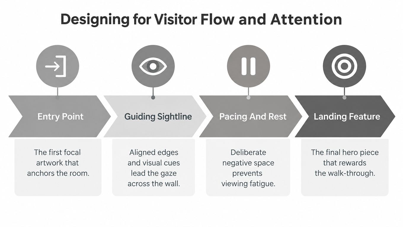
An entry point: The first work should establish the tone and give the eye somewhere to land.
A visual connector: Repeated edges, colors, materials, or sightlines can lead from one piece to the next.
A pause: Negative space gives the viewer room to reset rather than forcing constant visual processing.
A destination: A strong final work can reward movement through a corridor, room, or exhibition bay.
Curatorial principle: A gallery wall succeeds when people know where to look first, where to look next, and where they can comfortably stop.
Balance is not the same as symmetry
Symmetry is useful when the architecture calls for it. It creates authority around a conference table, reception desk, or centered fireplace. But symmetry can also flatten a collection when every object receives identical treatment despite differences in scale, subject, or material.
The better question is not whether each frame has an equal neighbor. Ask whether the visual weight is distributed across the room. A dark, dense painting may balance several pale works. A mirror may create a bright opening that needs a heavier object nearby. A small drawing may work as a transition, but not as the visual anchor for a large wall.
This shift changes the installation process. Instead of beginning with a pile of frames and a ruler, begin with the room's movement pattern, strongest sightline, and most important object. Then use measurement to make the intended experience repeatable.
The Core Measurements of Professional Hanging
Precise measurements support a strong installation, but they cannot replace judgment. A professional plan starts with a shared centerline, controlled spacing, and an honest assessment of how people will see the work from the room's actual routes.
A recurring eye-level benchmark places the visual focal point around 57 to 60 inches from the floor. This suits comfortable standing sightlines in residential and gallery settings. Austin Gallery's spacing guidance identifies 2 to 3 inches between artworks as a practical standard, with tighter gaps of 1.5 to 2 inches for smaller frames and wider gaps of 3 to 4 inches for larger works.
Establish the visual center
Measure from the finished floor, never from the baseboard or furniture. Find the visual center of the complete arrangement rather than defaulting to the center of its largest frame. For one work, position the artwork's center near the eye-level benchmark. For a group, lay out every piece first and calculate the center of the composition as one field.
Furniture changes the relationship. A sofa, credenza, or console creates a lower visual boundary, so the artwork should relate to it without appearing to sit on it. In a tall room, resist pushing the arrangement upward just to occupy unused wall. A lower, coherent group often reads with more intention than a stretched display that becomes uncomfortable to view.
Control the gaps
Spacing should appear deliberate while allowing the works to retain distinct identities. Use frame edges as the main reference and keep gaps consistent within the selected system. Smaller frames can support tighter spacing because their visual presence is lighter. Larger works need more breathing room, preventing adjacent edges from merging into one dense block.
Measure the hardware position before drilling. A wire, D-rings, cleat, or bracket may sit well above the frame's top edge, so calculate that offset for each piece. Projects involving several trades or unusual wall conditions also benefit from documented dimensions and accurate transfer of the plan. Guidance on measurement precision in AEC provides useful context for that process.
Use full-size planning methods
Paper templates, centerlines, and marked hanging points reveal errors before they reach the wall. Tape each frame footprint in place, then step back from the intended viewing positions. Check relationships with doors, furniture, switches, corners, and the routes people commonly use. A level verifies alignment, but it cannot determine whether the group sits too high, feels too dense, or loses connection with the room.
The familiarity of these conventions also reflects the history of salon hanging. European exhibition culture in the 18th and 19th centuries often displayed art densely from floor to ceiling. Later museum and interior layouts gave more emphasis to spacing, symmetry, and controlled sightlines, as described in this history of gallery wall layout practice. Current installations can draw from both approaches, pairing the salon's richness with the grid's discipline while leaving room for mixed media and changing viewpoints.
Designing for Visitor Flow and Attention
A visitor doesn't experience a gallery wall from a fixed camera angle. They encounter it while entering, turning, waiting, sitting, or passing through. That makes circulation a curatorial tool. The location of a work affects whether someone notices it, approaches it, compares it with another piece, or bypasses the entire sequence.
The INFORMS-reported museum study found that visitors are much less likely to move between artworks that are far apart, separated by floors, or difficult to access through digital guides. That doesn't mean every work should be crowded together. It means the designer must make the intended relationships physically easy to follow.
Map the first and second looks
The first look is what a visitor sees from the approach. The second look happens after they decide to move closer or turn toward the next wall. Test both. A powerful painting hidden behind a door swing, a reception queue, or a tall plant won't function as the anchor you intended.
Use sightline tests rather than assumptions:
Enter from the principal route and note the first visible artwork.
Walk at normal pace without stopping to see which pieces pass unnoticed.
Pause at natural decision points, such as a doorway, stair landing, or seating area.
Check transitions between groups, especially at corners and wall returns.
Identify the final landing point, where the sequence should resolve.
A visitor should be able to understand the next move without needing a sign. Repeated top edges, a shared horizon line, a gradual change in scale, or a color relationship can create that guidance. The device doesn't need to be obvious. In fact, the best sequencing often feels intuitive rather than instructional.
Build in rest and access
Dense arrangements create energy, but they can also exhaust the eye. Rest zones may be open wall, a bench, a change in material, or a quieter work placed between stronger pieces. In a corporate environment, a pause can also preserve circulation around a doorway or keep art from competing with a screen, meeting area, or reception conversation.
Lighting affects the same experience. Glare can force visitors to change position, while uneven illumination makes a sequence feel broken. A considered gallery lighting design plan should account for reflective glazing, surface texture, viewing angles, and the difference between ambient and accent light.
Design for real behavior
People don't always follow the route the designer imagines. They take shortcuts, gather in groups, stop to use a phone, or approach only the most prominent work. Leave enough clear floor space for movement and avoid making an important relationship depend on a narrow passage.
For offices and public venues, accessibility must be part of the composition from the start. Maintain usable routes, avoid protruding objects at head or shoulder height, and place interpretive material where it can be reached without blocking other visitors. A visually elegant wall that creates a bottleneck is poorly designed, regardless of how accurate its frame spacing may be.
Choosing Between Grid Systems and Salon Arrangements
The grid and the salon are not competing tastes so much as different structural tools. A grid asks the collection to behave as an architectural surface. A salon arrangement lets individual works retain more personality and creates a denser, accumulated sense of discovery.
A grid works when the inventory supports it. Frames need compatible proportions, consistent profiles, and enough visual discipline for the repeated alignment to read as intentional. The wall also needs careful preparation. Small inconsistencies become conspicuous across a long horizontal or vertical run.
A salon arrangement is more forgiving of varied frame sizes, but it isn't random. The installer still needs to control the outer boundary, visual center, weight distribution, and relationships between neighboring works. The eye should discover asymmetry within an underlying structure.
Match the system to the room
Use a grid in a contemporary office, a corridor with strong architectural lines, or a collection built around a repeated frame treatment. It can reinforce order around a conference table and make a group of related works feel like a single institutional statement.
Choose a salon approach for a residential staircase, an eclectic collection, or a room where history and texture matter more than formal repetition. It can accommodate paintings, photographs, drawings, and objects with different dimensions, provided the grouping has a controlled edge and a clear center of gravity.
Neither system automatically solves a difficult wall. A grid may emphasize a bowed surface or uneven ceiling. A salon may become visually noisy if every frame competes for attention. The room's architecture, the collection's character, and the viewer's route should decide the method.
Grid vs. Salon Layout Decision Matrix
Feature | Grid System | Salon-Style Arrangement |
|---|---|---|
Primary effect | Creates order, rhythm, and architectural clarity | Creates richness, accumulation, and discovery |
Best collection | Related works with compatible sizes or framing | Mixed sizes, frame profiles, media, and subjects |
Wall requirements | Accurate leveling and consistent structure | Controlled boundaries and deliberate weight distribution |
Strong setting | Corporate offices, contemporary interiors, formal corridors | Homes, stair halls, eclectic rooms, historical settings |
Main risk | Small alignment errors become highly visible | The group can feel cluttered without a clear hierarchy |
Planning method | Establish repeated axes and equal relationships | Build a composition around a center, edges, and visual anchors |
Installation judgment: A salon wall should feel collected, not accidental. An organized wall should feel alive, not automated.
The most successful hybrid arrangements borrow from both. A central row may establish a quiet grid, while a mirror or object interrupts the pattern at a deliberate point. Alternatively, a salon group can use a consistent lower edge or shared centerline to keep its irregularity under control. The distinction matters less than whether the chosen structure makes the collection and the room work together.
Integrating Mixed Media and Non-Traditional Objects
A mixed-media wall changes the engineering as much as the appearance. A framed work sits close to the wall, while a ceramic vessel, textile, or mirror may project forward, catch light, or carry weight through a very different mounting point. The arrangement must account for depth, shadow, reflection, material, and security.
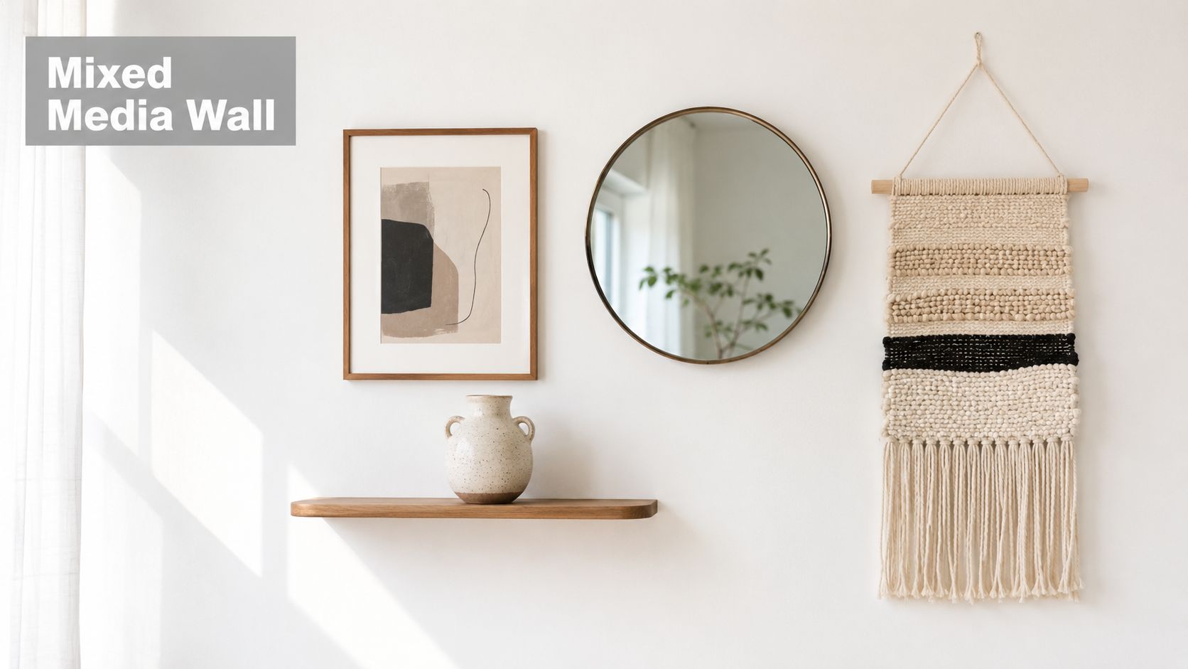
Recent design coverage describes a move away from rigid symmetrical walls toward layered installations that combine framed art with mirrors, ceramics, textiles, and other objects, as discussed in this overview of contemporary gallery wall layouts. The visual benefit is clear. Texture breaks up a uniform field, and a reflective or sculptural object can create a focal point that a row of similar frames cannot.
Compose by visual weight
Don't arrange mixed media by category alone. A small but dark ceramic object may carry more visual weight than a large pale drawing. A mirror may appear light in a dim room, then dominate once it reflects a window or chandelier. A woven textile can absorb light and create a soft counterweight to glazed frames.
Begin with the most demanding object. Establish its mounting position, projection, and safety requirements before fitting the surrounding works. Then create a relationship around it:
Repeat one quality: Use a shared color, curve, texture, or material to connect unlike objects.
Vary another quality: Let scale, depth, or orientation create rhythm.
Protect breathing room: Don't force a three-dimensional object into a gap designed for flat frames.
Control the edge: Check the outer silhouette from the doorway and from close range.
A mirror deserves special attention because it adds the room itself to the composition. Test what it reflects before fixing it. A beautiful arrangement can fail if the mirror points toward glare, a cluttered service area, or an unwanted view.
For collectors combining fragile, heavy, or unusually shaped pieces, mixed-media installation guidance can help clarify the planning and mounting issues before work begins.
The video below offers another visual reference for thinking about layered placement and object relationships.
Solve the physical problems early
Use suitable anchors for the wall construction and the object's load. Heavy or projecting pieces need more than a decorative hook, and a textile may require a concealed support that distributes pressure rather than pinching the material at isolated points. Keep fasteners, brackets, and cleats accessible for future inspection without making them visible from normal viewing positions.
Depth also affects circulation. A projecting object near a narrow route can become a hazard, while a low-mounted ceramic or sculpture may invite contact. In homes, consider children, pets, and cleaning routines. In offices and public spaces, consider queues, carts, doors, and emergency paths. The installation should look relaxed because the difficult decisions were made before the first anchor was set.
Adapting Layouts for Homes, Offices, and Galleries
A layout that succeeds in a gallery can feel misplaced at home, while a residential grouping may disappear in a corporate lobby. Viewing distance, visitor pace, circulation, wall construction, and maintenance all change the composition. Scale the installation to the behavior of the room, not to the artwork's dimensions alone.
In a home, viewers approach from familiar positions: a sofa, dining chair, stair landing, or hallway. Align the grouping with those sightlines and with the furniture beneath it. Residential rooms often benefit from intimacy. A small cluster can feel substantial at close range, whereas widely separated works may lose their relationship.
Residential conditions
Map doors, windows, switches, vents, lamps, and furniture before fixing the final arrangement. Paper templates reveal whether a grouping sits too high above a console or crowds a doorway. Stairwells require several checks rather than one floor-based centerline. Because the eye follows the slope, assess the sequence from different landings and approaches.
Private rooms still require disciplined risk control. Secure mirrors, heavy frames, and projecting objects according to the wall type. Keep fragile works away from routine contact, and leave enough access for dusting, inspection, and later adjustments. A composition that ignores cleaning or furniture movement will not remain successful after installation.
Commercial and institutional conditions
Offices and public galleries demand closer coordination with circulation, furniture, signage, and building operations. A lobby viewed from across the room may make a compact arrangement disappear against the architecture. In a double-height space, wider gaps can provide the visual separation needed at larger scale. Guidance may allow gaps to expand to 100 mm, about 4 inches, when the surrounding volume calls for it, as noted by Austin Gallery's installation guidance.
A tall wall does not require raising every artwork. Keep the primary viewing zone comfortable, then address the upper volume through architecture, lighting, or a larger work. Frameology's gallery wall rules describes the 57 to 60 inch visual center as a museum-style eyeline benchmark, with the arrangement read as one composition rather than as isolated frames.
Commercial installations also need a maintenance record. Document hanging points, artwork locations, hardware, access requirements, and any restrictions on doors or public routes. Institutions planning collection moves or temporary storage can use secure museum storage tips as planning context alongside the installation brief.
Specify the hardware with the environment
Public access may require tamper-resistant or concealed systems. Select anchors according to the substrate, artwork weight, projection, and the consequences of failure. Rental spaces and frequently reconfigured offices may benefit from a track system, provided it is leveled precisely and paired with an agreed visual standard.
A professional layout converts room constraints into clear spatial decisions. The result should remain safe, legible, and maintainable after opening day, even as people, furniture, and operations move through the space.
Executing the Final Installation and Lighting Plan
The final installation is where a drawing becomes a physical environment. Before arriving on site, confirm the wall dimensions, substrate, artwork list, frame depths, hardware, access equipment, and lighting conditions. A layout that works on paper may need adjustment when a conduit, stud, sprinkler, uneven corner, or reflected window appears in the actual room.
Begin with a clean reference line. Mark the primary centerline and key edges, then place templates or use a measured hanging schedule to transfer each fixing point. Check level across the full run rather than trusting one frame at a time. Small deviations accumulate, especially in a grid, and the eye catches the drift even when each individual piece seems acceptable.
Protect the wall and the collection
Inspect the substrate before selecting anchors. Drywall, masonry, paneling, and specialty surfaces require different fixing methods, and heavy or deep objects may need reinforcement rather than a stronger-looking hook. Use protective pads where appropriate, keep hardware from stressing frame corners, and handle glazing and finished surfaces with clean gloves and controlled movement.
Lighting should be tested from the visitor's position. Adjust fixtures to reveal texture without creating glare, hot spots, or distracting reflections. Reflective glazing and mirrors often require a change in angle rather than just more light. Sculptural pieces need enough side definition to show depth, while works on paper may need a more even field.
The gallery hanging and installation guide from Colorado Art Services is a useful reference for coordinating placement, hanging points, and professional execution. On a complex project, the installer should also record final positions so future maintenance doesn't turn into guesswork.
Final check: Walk the route at normal speed, stop where visitors naturally stop, and inspect every work for level, glare, clearance, security, and visual connection.
A flawless gallery layout design isn't judged only by the first photograph. It must remain coherent when the room fills with people, when daylight changes, when a door opens, and when staff need to clean or service the space. Precision gives the composition stability. Skilled installation gives it the quiet finish that lets the art take over.
Colorado Art Services plans and installs gallery layouts for homes, offices, galleries, and commercial spaces, including framed art, mirrors, sculpture, grid displays, and high-placement work. Visit Colorado Art Services to discuss a precise installation plan built around your collection, architecture, lighting, and wall conditions.
Comments