


Commercial Office Decor: How to Place Art That Works
In 2025, 59% of organizations in the United States and Canada planned to increase investment in office fit-outs over the following five years, according to JLL's 2024 Future of Work survey reported by JLL. That spending only pays off if commercial office decor does a job, not just fills a wall. In a hybrid office, a piece has to support focus, read well on video calls, help people find a room, and move when desks move.
Think of art placement as part of a performance system. You're deciding height, scale, and sightlines for people who may be in the room two days one week and five the next. Get those basics right first, and brand, colour, and style choices become much easier to judge.
Placement Rules and Use Cases by Office Zone
Start with this quick reference, then measure your own walls against it. The scale is a starting point for planning, not a substitute for standing in the room and checking the view from the door.
Zone | Artwork scale | Avoid |
|---|---|---|
Reception and lobby | One strong piece filling 60 to 75% of wall width | Blocking entry sightlines |
Boardroom | One large piece centred on head of table | Reflections off the screen wall |
Open work floor | Work filling 40 to 60% of wall width | Competing with monitor backdrops |
Focus pods and quiet rooms | One restrained piece | High-contrast or busy images |
Break room | Two or three medium pieces filling 40 to 60% of wall width | Hanging above appliances or heat sources |
Corridors | Repeated pieces at even spacing | Blocking fire routes or door swings |
Setting the Centre Line
Hang most work so its centre sits at 145 to 155 cm (57 to 61 in) from the floor. That's average standing eye level, and it's why gallery pieces feel comfortable to look at without tilting your head. In a lobby where people mostly stand and walk, stay near the top of that range. In a meeting room where people sit for an hour, test the lower end from a chair, because a piece that reads well standing can feel stranded above seated sightlines.
Above furniture, use a different rule. Leave 15 to 25 cm between the bottom of the frame and the back of a sofa or credenza. A smaller gap ties the piece to the furniture below it. A much larger gap makes both look disconnected, and readers often assume the art is too small when the problem is the gap.
Practical rule: Mark the centre line with painter's tape before you drill anything. Tape costs almost nothing, and moving tape is easier than filling holes.
For wall-filling features intended to be seen from a distance, the same visibility logic applies as in Stobbe Design's donor wall location guide, which is useful reading on how placement affects whether people notice a wall at all. A piece tucked beside a door swing or behind a coat stand isn't a focal point, whatever it cost. Put your strongest work where the main entry view lands first.
Two Worked Examples
Say you've got a 240 cm lobby wall behind reception. A single 160 cm wide piece fills 160 divided by 240, or about 67% of the wall width. That lands inside the 60 to 75% range, leaves breathing room on both sides, and gives visitors one clear thing to look at while they wait. Three small prints on the same wall would fill less, read as clutter from the door, and give you three frames to keep level instead of one.
Now take a 300 cm boardroom wall. Rather than centring a large piece on the wall itself, centre it on the head of the table, where the person leading the meeting sits. On a video call, that person is framed by the artwork behind them, so choose something with soft edges and no text, faces, or sharp diagonal lines that seem to grow out of their head on camera. Test it with a laptop camera before installation. What looks calm in person can look busy in a small video window.
Matching Art to What Happens in the Room
Each zone asks something different of the work on its walls:
Reception carries the brand statement: One strong piece, clearly visible from entry, with nothing competing on the same wall.
Boardrooms protect the call: Matte finishes, no glass glare toward the camera, and nothing hung on the screen wall itself.
Focus zones stay restrained: A single quiet piece, or none, so the wall doesn't pull attention from the task.
Collaboration walls stay flexible: Magnetic panels, pin-friendly boards, or modular pieces teams can rearrange as projects change.
Client hosting areas hold two or three pieces: Enough to feel finished and conversational, not so many that guests scan the walls instead of listening.
On open work floors, the 40 to 60% range keeps monitor sightlines clear. Hang work on end walls and between window bays rather than directly behind rows of screens, where it becomes a fragmented backdrop nobody sees whole. In corridors, repeated pieces at even spacing do double duty. They give a long route rhythm, and people use them as landmarks when giving directions.
Planning for Hybrid Attendance
Commercial office decor now has to work at two densities. In 2025, employers expected employees to be in the office 3.2 days per week, while employees averaged 2.9 days, and 73% of organizations said peak-attendance days were effectively at capacity, according to the CBRE 2025 Americas Office Occupier Sentiment Survey. A quiet Tuesday and a packed Wednesday punish different mistakes. Art that blocks a reconfigurable table layout or narrows a route becomes a safety problem on peak days, even if nobody noticed it all month.
That's why more decoration is not automatically better. A large canvas behind flexible seating may prevent tables flipping up against the wall. Sculpture on a circulation corner gets clipped by bags when the floor is full. Plan for the busy day, and the quiet day takes care of itself.
Build movement into the system from the start:
Rail or track systems: A ceiling or wall rail with sliding hooks lets you shift pieces sideways or swap them without new holes.
Lightweight frames: Aluminium frames and canvas on stretcher bars are easier for two people to move safely than heavy glazed frames.
Standard sizes: If rotating pieces share two or three sizes, they fit the same hanging points every time.
A placement sheet and photo plan: Record each wall, piece, centre height, and hook position, with a phone photo of the finished layout, so any reset takes minutes.
Close every placement decision with a three-step check. Measure the wall and do the percentage maths. Mark the centre line with painter's tape and hang nothing yet. Then stand at the main entry at eye level and confirm the piece reads from there, not just from directly in front of it. If it fails the doorway test, it fails, whatever the tape measure said.
Why Decor Changes How Staff Work
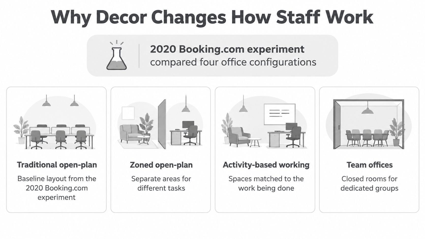
Employees reported 17% higher productivity in zoned open-plan offices than in conventional open-plan layouts in a 2020 real-world experiment at Booking.com, published in PLOS ONE's report of the Booking.com experiment. The experiment compared four configurations in a working technology company: traditional open-plan, zoned open-plan, activity-based working, and team offices. Because real employees worked in the spaces rather than rating photographs, the differences are practical planning evidence.
What the Four Layouts Showed
Team offices also scored 10% higher on reported productivity than the conventional open-plan condition. Activity-based working scored 14% lower on the same measure. Zoned open-plan and team-office environments also improved satisfaction, enjoyment, and work flow, which matters because people choose to use spaces they enjoy.
The pattern is the lesson. Layouts that clearly separated areas for different tasks beat both the undifferentiated floor and the fully flexible model. People didn't need more choice in the abstract. They needed to walk into an area and immediately understand what it was for.
What This Means for Artwork
Art is one of the most affordable zoning tools you have. A large, calm piece on the end wall of a focus bank signals that this area is quiet without needing a sign. A consistent series along a corridor marks a route. A single bold work behind reception lets visitors know they've arrived somewhere specific. Used this way, a piece acts as a wayfinding anchor, something people use as a reference point and describe to others.
The reverse also holds. A sculpture placed where a zone boundary should be clear blurs it. Frames hung along a narrow route at shoulder height make the route feel narrower and invite knocks. If you want ideas for layouts that give each area its own character, our guide to building creative office environments works through examples room by room.
A well-placed piece explains the room before anyone speaks. A poorly placed one makes people work around it.
Try this exercise before you buy anything. List every zone in your office on one page: entry, focus, collaboration, meetings, client areas, routes. Beside each, note whether a newcomer could tell what it's for within five seconds. The zones that fail that test need a stronger visual identity, and they're where your first pieces should go.
Aligning Art With Brand Identity
Start from your stated values, then translate them into a short list of art themes. A firm that talks about regional roots might use local photography. One that sells precision might choose geometric abstract work with clean edges. What you shouldn't do is copy the logo across every wall or match one brand colour exactly, because the office starts to read as packaging rather than a place to work.
Use the brand palette as one or two accent tones within the art, not the whole scheme. A mostly neutral photograph with a thread of your brand colour in it feels intentional. A wall of prints all printed in that colour feels loud by lunchtime, especially in rooms where people need to concentrate or decompress.
Giving Each Zone a Brand Role
Assign each area one job so pieces don't all try to say everything:
Reception states identity: The most recognisably on-brand piece in the building lives here.
Boardroom signals credibility: Restrained, well-framed work that supports trust and doesn't date quickly.
Corridors carry repeated motifs: A consistent theme or format that supports wayfinding between departments.
Staff areas can loosen up: Work chosen with employees can be warmer and more personal, since clients rarely see it.
Writing a Short Brand Brief
Give whoever selects and hangs the work a one-page brief. Cover approved themes, subjects to avoid (political imagery, text-heavy graphics, anything a client could misread), the maximum number of pieces per wall, and who signs off placements before drilling. One page prevents the slow drift where each department adds its own prints until no wall matches another.
Decide in the brief whether art rotates with campaigns or seasons. If it does, rotating pieces must fit the same sizes and hanging points as the work they replace, or every rotation becomes a repair job. Build that constraint into commissions from the start.
Then run an alignment test. Walk the space with your brand guidelines in hand and mark any piece a visitor could misread as a statement the company doesn't make. An aggressive image in a client waiting area or a joke print visible on video calls fails, however good it looks. Involve staff in theme selection too, with a shortlist vote for staff areas. People look after work they helped choose, and they notice quickly when head office taste doesn't reflect the team in the room.
Lighting and Wall Conditions That Make Art Read
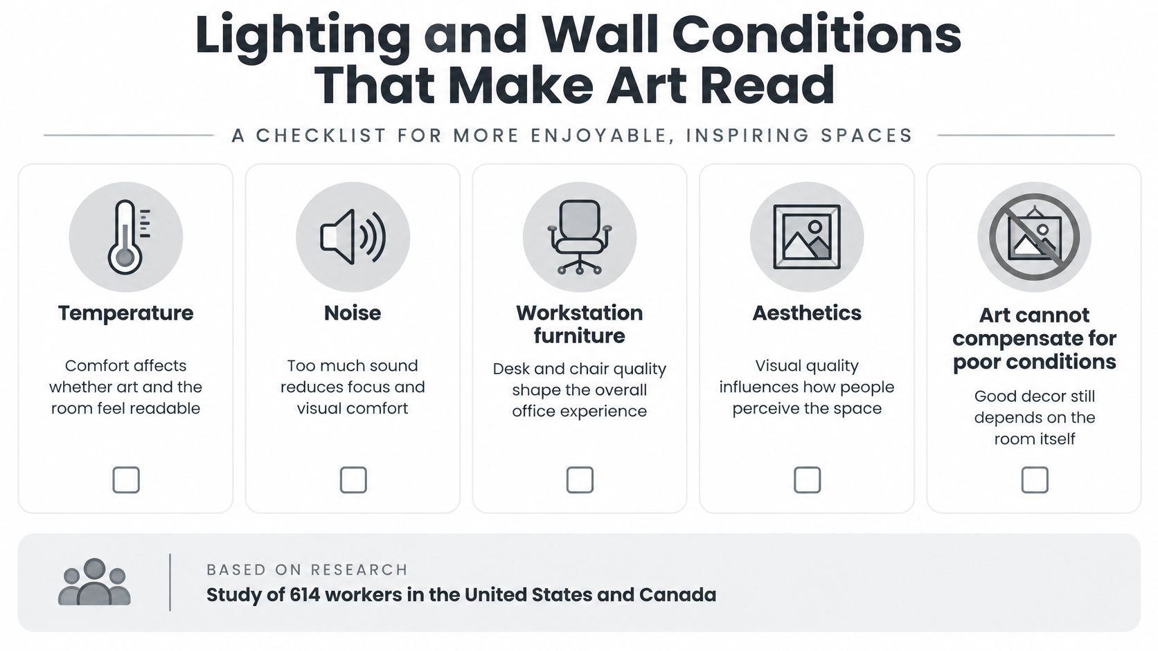
Art cannot compensate for a room that feels bad to sit in. Research involving 614 workers in the United States and Canada found that temperature, noise, workstation furniture, and aesthetics were major predictors of perceived work effectiveness, and a 2023 review singled out air quality, natural light, and thermal comfort as the features with especially significant effects on employee productivity, as summarised in the Journal of Environmental Psychology review on workplace design. Fix glare, heat, and noise first. Then your artwork has a fair chance of being noticed for the right reasons.
Lighting the Piece, Not the Glass
Aim light at artwork from the front or slightly above, at roughly a 30-degree angle to the wall. Straight down from a ceiling spot creates a bright band at the top of the frame and shadow below. Straight on from across the room bounces off glazing into viewers' eyes. The 30-degree angle is the standard compromise because the reflection bounces down toward the floor instead.
Choose warm white light in the 2700 to 3000K range with a high colour rendering index, listed as CRI on the lamp packaging. High CRI means reds and skin tones in the artwork look as the artist mixed them, rather than greyed out. If your existing ceiling fittings can't do this, a planned office lighting upgrade handled as proper commercial electrical work beats clip-on picture lights trailing cables in a client area. For fixture types and spacing, our overview of art display lighting choices covers the common options.
Keep reflective surfaces away from trouble. Don't hang glossy frames, glass glazing, or mirrors directly opposite bright windows or large screens. The piece becomes a second window, and people see the reflection instead of the image. Matte or anti-reflective glazing costs more per piece, so reserve it for walls you can't reposition.
Checking the Wall Before Anyone Drills
Walls in commercial buildings hide surprises. Before installation, confirm:
Stud and substrate type: Plasterboard on metal studs, solid masonry, and concrete each need different fixings and load ratings.
Services in the wall: Power cables, data runs, and HVAC ducts often sit exactly at picture height in fitted offices.
Wall finish: Fresh paint, vinyl wallcovering, and stone or timber cladding all limit where holes can go and how they're repaired later.
Weight per fixing: A large glazed frame may need two fixings into structure, not one hook in plasterboard.
A Walkthrough Checklist
Walk each wall at the time of day it'll be seen most, and check six things. Is there window glare across the hanging position. Do screens reflect in the proposed spot. Does the ceiling height suit the piece's proportions. Is the wall finish drillable and repairable. Is there power access if the piece needs its own light. And will the work be seen from the main route, or only by people already standing in front of it. Two failures on that list usually mean a different wall, not a bigger frame.
Designing Art for Sensory-Sensitive People
Art can help a workplace feel welcoming, but a wall packed with strong colour and busy patterns can make it harder to concentrate. In a hybrid office, decor has to support focused work, collaboration and video calls while offering sensory comfort. The aim is to give people a choice of settings, not to make every room feel the same.
Global research cited by Skanska estimates that roughly one in five people is neuroatypical, according to Skanska's report on designing neuro-inclusive workspaces. Pattern, contrast and reflection can also affect people who experience migraines or visual sensitivity. That does not mean every wall should be bare. It means creating a range of visual environments, from lively shared spaces to calmer places for focused work or a reset.
Why Choice Is the Real Goal
Many office workers feel their workplace falls short of a good experience, and having a choice of where to work has become more important since the pandemic. Art can contribute to that choice when people can move from a visually active collaborative area to a room with quieter surroundings.
If every room shouts, there's nowhere to recover. Variety between rooms matters more than restraint in any single piece.
This balance also matters on video calls. A distinctive artwork can give a shared room character, while a high-contrast or intricate backdrop may compete with the speaker on screen. Consider how the wall looks both in person and through a camera before settling on a piece.
Controls You Can Specify
Focus and decompression rooms: Choose one or two restrained pieces with low contrast and generous calm areas. A bare wall can also be a deliberate choice.
Reflective surfaces: Avoid glossy frames or mirrors opposite windows or screens. Reflections change as people move, drawing attention away from the task.
Pattern and contrast: Limit tight, repetitive patterns and intense colour contrasts where people sit for long periods. They can cause visual discomfort.
Tactile sculpture: Use alcoves or display niches, away from circulation routes. Check that a piece does not narrow an accessible path or invite people to brush past it.
Wayfinding clarity: Keep artwork separate from signs, door numbers and safety notices. Visitors should be able to read routes and instructions without distraction.
Before final placement, invite staff with sensory needs to take part in a short survey or walkthrough. Ask which walls feel comfortable and which feel distracting, then record their feedback alongside placement measurements. That record can guide future layout changes, so a piece that suits a lively collaboration zone does not end up in a room people use to focus or reset.
How Budgets Shape Decor Within a Fit-Out
Art is usually a small line in a fit-out budget, and that's fine, provided it's planned rather than leftover. For scale, JLL's Global Office Fit-Out Costs Guide 2025 reports that in 2025, furniture accounted for 13% to 16% of total commercial office fit-out costs across regions. When a single category takes that share, decor squeezed in at the end gets whatever cash and wall access remains, which is how offices end up with expensive chairs facing blank plaster.
Plan the decor budget alongside furniture, lighting, and acoustic work instead. Those trades share walls, ceiling access, and installation windows. A picture light needs power, an acoustic panel competes for the same wall as a canvas, and both decisions are cheaper before furniture is in the way.
Where to Spend First
Spend in the order visitors and staff experience the building:
Reception and boardroom: These carry brand and client impression, so they get the best pieces, proper framing, and dedicated lighting.
Breakout and shared areas: Staff use these daily, and good work here supports the choice and recovery the rest of the floor depends on.
Corridors: Repeated, moderately priced pieces in a consistent format cover long routes without one-off costs.
Back-of-house zones: Functional boards and simple prints are enough where clients never go.
Phasing in this order means a budget cut trims the corridor series, not the reception statement. It also means the rooms photographed for recruitment and client decks are finished from day one.
The Cost Lines People Forget
Build the worksheet with every line visible:
Artwork and display systems: Purchase or lease of pieces, plus rails, panels, and fixings.
Framing: Reframing existing work to a consistent profile often costs more than expected.
Hanging labour: Installation time, including access equipment for high placements.
Lighting adjustments: New fittings, lamp changes, and electrical work for picture lights.
Wall repairs: Filling and repainting when pieces move or come down at lease end.
Storage: Space for spare and rotating pieces, wrapped and labelled rather than stacked in a plant room.
Hold a contingency line for changes after occupancy, because hybrid layouts shift once teams settle. Finish with a simple worksheet: list each zone, assign its priority, estimate each cost line, and mark which items can phase into a second year. If a zone has no budget line, it has no plan, and it will show.
Hiring an Installer Without Surprises
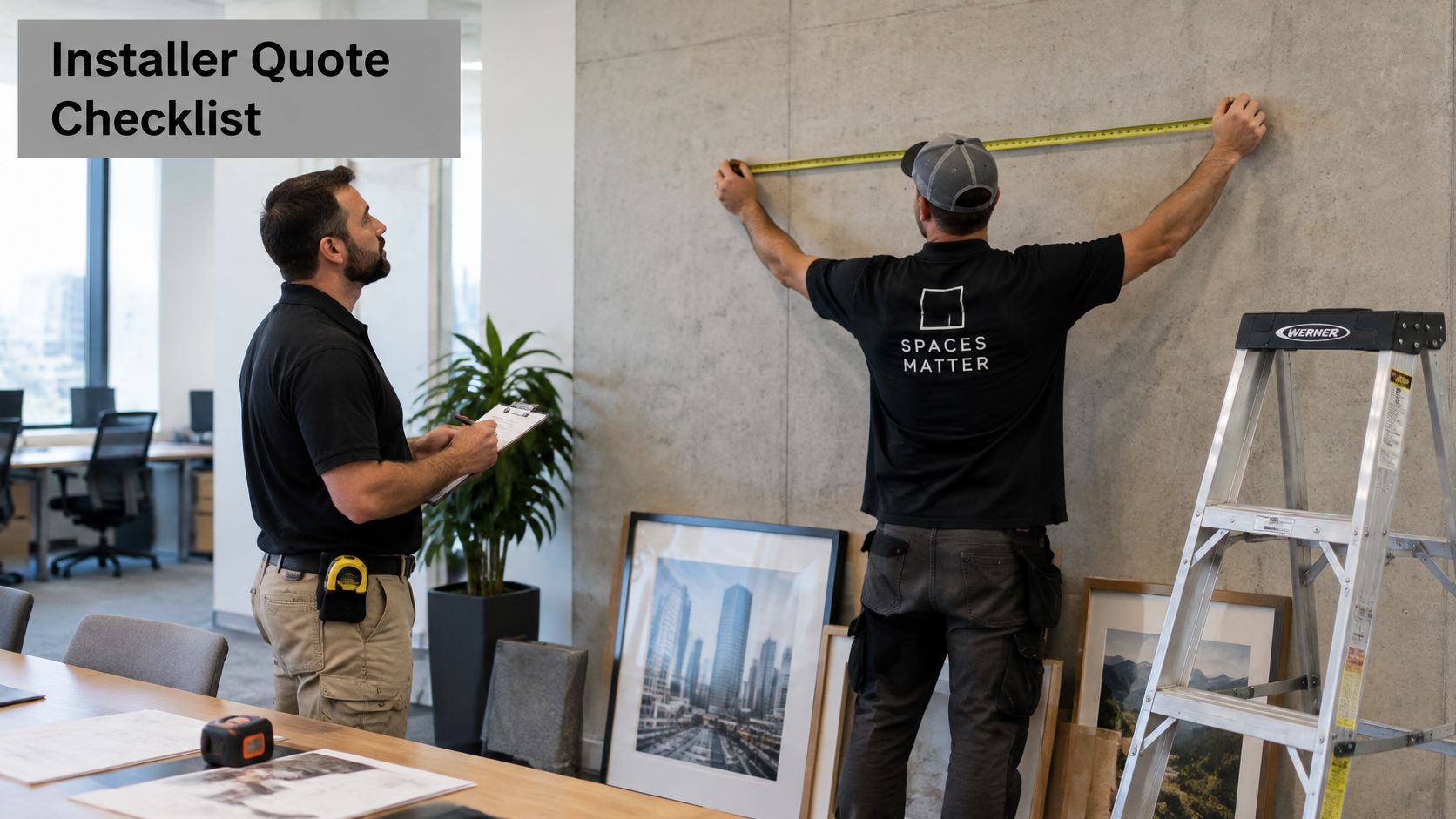
An installer can only quote accurately if you describe the job accurately. Before any call, prepare four numbers: how many pieces need installing, whether ladders or scaffolding are required, whether the work involves drilling into hard surfaces such as concrete or tile, and the dimensions of the largest piece. Those are exactly the questions our contact form asks, because they determine crew size, equipment, fixings, and time on site. Add a rough floor plan with target walls marked, so every provider quotes the same job.
Credentials to Confirm First
Ask whether the installer carries public liability insurance and can provide a certificate of insurance for work on occupied floors. For reference, we're fully insured, and we've spent over 15 years in picture hanging and art handling throughout the greater Denver metropolitan area. Whatever provider you use, ask how long they've worked on commercial sites locally and request two references from similar offices, not residential jobs. Occupied commercial work involves building management rules, freight elevators, and out-of-hours access that house calls don't.
Wall condition is part of the conversation too, especially if repainting or repairs are in the same programme. If you're coordinating trades, a painting contractor checklist for property managers is a handy model for the kind of written scope and sequencing questions to settle before anyone starts.
The Same Questions for Every Provider
Put these to each installer in writing and compare the answers side by side:
Finding structure and services: How do you locate studs and check for cables and HVAC ducts before drilling.
Wall damage: What happens, and who pays, if a wall is damaged during installation.
Layout approval: Will you provide a layout drawing or taped positions for sign-off before drilling.
Level and spacing checks: How do you verify pieces are level and evenly spaced after installation.
Future changes: How do you handle removal or relocation when our layout changes, and what does that visit cost.
Our explanation of what professional art installation involves gives you a baseline for judging those answers. Vague reassurance isn't an answer. You want a named method, such as a stud finder and service scan on every wall, and a stated making-good policy.
Watching a short installation walkthrough before your site visit helps you follow what the crew is doing and why.
Finally, ask for a written quote with separate lines for hanging labour, materials, access equipment, and making good. A single lump sum hides the assumptions, and assumptions are where surprises live. If two quotes differ widely, the line items tell you whether someone missed the scaffold, the concrete drilling, or the Saturday access your building requires.
Confirm Your Decor Plan This Month
You can finish a workable plan in a month if you keep the sequence tight and write decisions down as you make them. Work through these steps in order, because each one feeds the next:
List every zone and assign one role: Brand, focus, collaboration, client hosting, or circulation. One role per zone keeps later arguments short.
Measure each wall: Apply the centre-height and scale rules from your placement table, and record the numbers rather than eyeballing them.
Walk the space at different times of day: Morning and late afternoon sun expose glare and screen reflections that a midday visit misses.
Compile the installer preparation list: Number of pieces, largest dimension, ladder or scaffold needs, and which walls need drilling into hard surfaces.
Shortlist two or three providers: Send each the same preparation list and the same questions, and request written estimates with separate cost lines.
Set a review date tied to attendance patterns: After your next known peak period, check whether placements still work at full occupancy, and plan moves rather than replacements.
When installation is done, record the final layout in your placement sheet and photo plan on the same day, while positions are fresh. That record is your baseline for every future change. Without it, the next refresh starts with someone guessing why a piece was hung where it was, and guessing usually ends with unnecessary holes.
If you'd like help turning the plan into an installed layout, call us for a quote or to talk through your project on 303-243-0066. We're open Monday to Friday from 8am to 5pm, with evenings and weekends by appointment, which suits occupied offices that can't have drilling during the workday. Bring your zone list and wall measurements to that first conversation and you'll get a far more useful estimate.
Colorado Art Services installs commercial office decor across the Denver metro area, from single reception pieces to full-floor layouts with grid displays, mirrors, and sculpture placed safely and level. If your placement sheet is ready, or you want help building one, visit Colorado Art Services to request a quote and schedule your installation.
Comments