


Office Wall Art Design: A Practical Planning Guide
You're looking at a blank reception wall, a stack of framed prints, and a deadline that's getting uncomfortably close. The furniture is already in place, the brand colors are fixed, and someone has just asked whether the art can be installed before the next client visit. That's when office wall art design stops being a styling exercise and becomes a coordination problem involving scale, sightlines, wall construction, lighting, safety, and workplace culture.
I've installed artwork in offices across Colorado, from straightforward drywall layouts to high lobby walls with strict building requirements. The projects that look effortless usually start with the most unglamorous work: measuring the room, understanding who uses it, testing the layout, and choosing hardware that belongs on that specific wall. The art matters, but the preparation determines whether it feels intentional or merely attached.
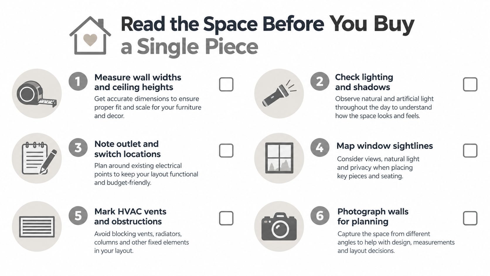
Read the Space Before You Buy a Single Piece
The first mistake is shopping before surveying. Walk the office with a tape measure, flashlight, notepad, phone camera, and a simple floor plan. Record wall widths, ceiling heights, baseboards, furniture dimensions, door swings, switches, outlets, windows, and HVAC vents. A wide wall can become a poor art location if a supply vent blows directly across the frame or a door clips its corner.
Look at the room from the way people occupy it. Art placed behind a monitor may be technically visible but functionally ignored. A piece opposite a conference table can become a useful focal point, while art beside a circulation path may need stronger anchoring and more clearance. Photograph each candidate wall with the furniture in place, not as an empty architectural surface.
Build the brief from the building
Wall construction changes the installation plan. Drywall over wood studs, drywall over steel studs, plaster, concrete, brick, and metal panels all require different fasteners. In Colorado offices, newer commercial interiors commonly use steel framing, while older buildings may have plaster and lath. Exterior walls in high-elevation locations can also contain rigid insulation that prevents a standard plastic anchor from holding properly.
Before specifying art, mark:
Wall conditions: Identify drywall thickness, studs, plaster, concrete, brick, or insulated cavities.
Building restrictions: Confirm landlord rules for penetrations, cabling, elevators, ladders, and after-hours work.
Safety zones: Keep clear of sprinklers, HVAC equipment, electrical runs, and required access paths.
Viewing direction: Note whether occupants face the wall, pass it quickly, or see it from a reception queue.
Brand cues: Photograph flooring, door hardware, lighting finishes, furniture, and textiles so the art supports the existing environment.
A useful resource for developing a more distinctive collection is unique wall art from Quote My Wall, particularly when a standard catalog print doesn't reflect the office's identity.
Installer's rule: If you haven't photographed the wall in context, you don't yet know whether the piece belongs there.
This audit also exposes budget risks early. A large framed work may need specialized glazing, a deeper frame, two attachment points, or lift access. A gallery wall may require more labor than the art itself suggests. Measure first, then source pieces that fit the building rather than forcing the building to accommodate a purchase.
Translate Brand and Culture into Art Choices
A logo palette isn't an art direction by itself. Turn it into a usable visual system. Pull three colors from the identity, then assign each a job: one dominant accent, one recurring note in the artwork, and one quieter neutral for frames, mats, or nearby textiles. This gives the collection consistency without making every piece look like branded collateral.
The subject should reflect how the room functions. A legal practice or financial office may benefit from restrained scenery, architectural photography, or muted abstracts that don't compete with concentration. A creative studio can usually carry stronger color, typographic work, collaborative murals, and unusual materials. Reception areas can support a brand-forward hero piece, while private meeting rooms often need art that remains engaging without becoming a debate topic.
Choose material with intent
Material communicates as much as imagery. A crisp photographic print can reinforce precision and modernity. A hand-pulled serigraph feels tactile and deliberate. Original mixed-media work or art from a Colorado artist can signal local investment and authenticity, but it may also require more careful framing, handling, and conservation planning.
Avoid choosing only by what looks good on a screen. Fluorescent light, daylight, textured paint, and glazing all change color perception. Ask for room-based comps showing the proposed art above the actual furniture, then compare two or three directions before approving production.
Use frame finishes as the connecting detail. Black metal can echo lighting and door hardware. Natural wood can soften a technical office. A quiet neutral frame can keep a colorful collection from becoming visually noisy.
Client-facing spaces: Use clear, memorable pieces that support conversation and orientation.
Focus areas: Favor lower-contrast compositions with controlled color and less visual clutter.
Collaborative zones: Consider art that invites interpretation, discussion, or employee contribution.
Healthcare settings: Avoid emotionally charged imagery and prioritize calm, accessible compositions.
Research summarized by corporate office art guidance from Colorado Art Services also supports treating workplace art as part of the broader environment, not as an afterthought. Workplace-art research has connected art with social interaction, emotional response, personal connection, environmental quality, and learning, as outlined by the Harvard Project Zero synthesis on workplace art. The practical implication is simple: select work that helps people understand the character of the place.
Scale, Spacing, and Layout Rules That Actually Work
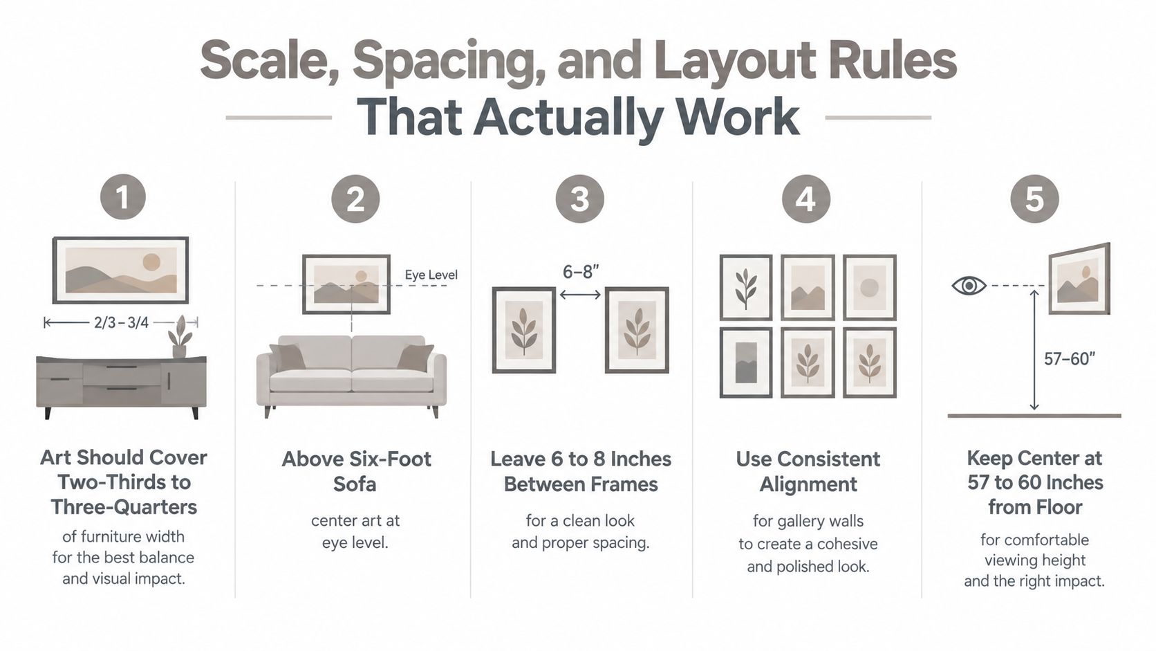
Most office art feels wrong for one of two reasons. It's too small for the wall, or it's hung too high to relate to the furniture and people below it. A reliable starting point is to make the artwork occupy roughly two-thirds to three-quarters of the furniture or wall zone it serves.
Above a six-foot sofa or credenza, a combined art width of about four to four-and-a-half feet usually creates enough presence without overwhelming the furniture. For a single piece, center the visual composition about 57 to 60 inches from the floor, measuring to the center of the art rather than the top of the frame. Above a desk, leave at least eight inches between the monitor and the bottom of the frame so the screen can tilt and the art doesn't feel trapped behind equipment.
Work through common layouts
For pairs, keep the gap tight enough that the two pieces read as one unit. A separation of two to three inches normally works well. Match their outer edges and align their centers unless the room's architecture gives you a stronger line to follow.
Gallery walls need one center point. Don't center every frame independently over the furniture. Treat the entire arrangement as one composition, establish its outer boundary, and align that boundary to the sofa, credenza, reception desk, or architectural feature.
A grid succeeds through repetition. Use identical frames, consistent mats, and clean four-inch gaps when you want order. An eclectic arrangement needs a shared element, such as frame color, mat width, subject matter, or tonal range, or it will look like unrelated leftovers.
Reception walls are viewed from farther away than desk art, so they need more scale. A small print can disappear in a lobby, while a substantially larger piece can hold the room and remain legible from the approach.
Measure the composition, not just the frame. Mats, float mounts, shadows, and irregular edges all change the visual footprint.
For offices using digital displays or motion-based visual content, create AI image animations with Nim can provide an additional presentation layer, but don't let movement replace the physical scale and placement decisions that make a wall work.
A practical visual demonstration of layout thinking is included below.
Mockups, Templates, and Lighting Before You Drill
Paper templates are cheap insurance. Cut kraft paper or newspaper to the exact outside dimensions of every framed piece, including the frame rather than just the image. Tape each template to the wall, mark the intended nail or screw points, and photograph the arrangement from the typical eye line.
Leave the templates in place long enough to see the layout during normal use. Check it from the reception desk, conference table, hallway, and nearest workstation. A composition that looks balanced straight on may feel too high from a seated position or may collide with a door swing that wasn't obvious on the plan.
Test the whole grouping
For a gallery wall, create a floor layout using painter's tape on a long counter or open floor. Work from the largest anchor pieces outward, then adjust gaps and edge alignment. Photograph the final arrangement before transferring it to the wall. That record helps prevent the common error of reversing pieces or losing the intended rhythm during installation.
Lighting belongs in the mockup phase, not after the frames are already mounted. Picture lights can create attractive emphasis, but they need suitable electrical planning, a cord-cover strategy, and enough separation from the art to avoid hot spots. Track heads should be aimed to reduce glare from the viewer's position rather than pointed at the center of the frame.
Colorado's elevation and strong sunlight make glazing worth discussing early. For south-facing walls, ask the framer about UV-filtering acrylic or museum glass, then confirm window-film and shade schedules with facilities. Glazing won't fix poor placement, but it can help protect sensitive work when the room receives sustained daylight.
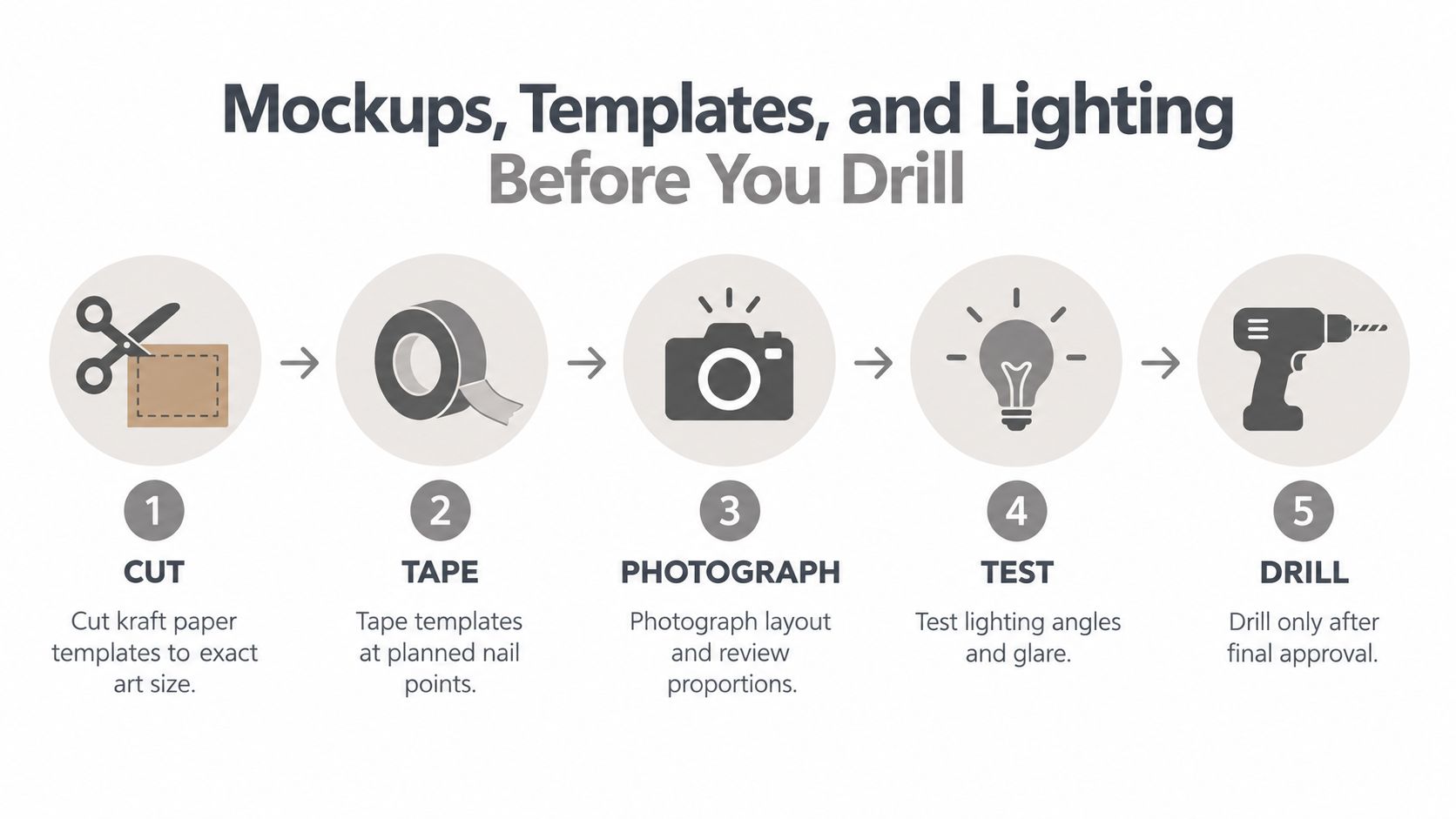
For more detail on aiming fixtures and coordinating illumination with the hanging plan, see this guide to art installation lighting in Colorado offices. Approve the paper layout and lighting direction together. Otherwise, a frame may look perfect in daylight and reflect every ceiling fixture once the office is occupied.
Mounting, Hardware, and Safety on Commercial Walls
Hardware selection starts with two questions: what is the wall made of, and how much does the complete framed piece weigh? The answer isn't based on the artwork alone. Add the frame, glazing, backing, mounting system, and any future movement or vibration.
Commercial drywall over steel studs often needs a different approach from residential drywall. A light piece may work with a rated picture hanger, but heavier work generally calls for a snap-toggle, zip-toggle, stud attachment, or French cleat. Concrete and concrete masonry units need masonry-rated anchors installed with the correct drill and bit. Plastic anchors are not a substitute for a proper concrete fastening system.
Match the wall to the load
Wall Type | 0–20 lb | 21–50 lb | 51 lb and up |
|---|---|---|---|
Drywall over wood stud | Rated hanger or wood screw into stud | Wood screw into stud, paired attachment when appropriate | Stud-mounted French cleat or engineered system |
Drywall over steel stud | Rated hanger for suitable light loads | Snap-toggle or zip-toggle selected for the wall assembly | Engineer-approved toggle, stud system, or French cleat |
Plaster and lath | Pre-drilled rated anchor | Anchor matched to lath and substrate | Structural review, cleat, or dedicated support |
Concrete or CMU | Sleeve or masonry-rated anchor | Sleeve or wedge anchor selected for substrate | Engineered anchor system and professional assessment |
The table is a planning guide, not a replacement for the anchor manufacturer's load rating or the building's requirements. Hardware ratings apply to specific installation conditions, and a hollow wall can fail when the fastener is technically strong but the substrate is not.
Check behind the wall before drilling. Confirm sprinkler clearances, HVAC routes, electrical wiring, low-voltage cabling, and access panels. Pieces over 24 inches wide, and any art mounted above seating, deserve two-point attachment so they can't rotate around one fastener. In multi-tenant buildings, ask whether a seismic tether or other restraint is required.
Safety is part of the design. A beautiful lobby installation that can shift, fall, or block building equipment is an unfinished installation.
If the office also needs branded motion content or documentation around a launch, commercial video production from Image Studio can support the visual side, but video work doesn't replace a wall-specific mounting assessment. Oversized acrylic, cable systems, and high placements should be reviewed by someone who understands both the artwork and the building.
DIY, Handyman, or Professional Installer
A facility manager can make this decision without guessing. Score the project against five factors: number of pieces, total weight, wall type, height, and liability exposure. A single light frame on accessible drywall is a different job from a gallery wall on mixed substrates above a client seating area.
DIY works when the scope is small and the conditions are obvious. Use a stud finder, level, measuring tape, and manufacturer-rated hardware. If the wall contains steel studs, concrete, plaster, or hidden services, the apparent simplicity can disappear quickly.
A handyman or maintenance contractor is often suitable for a modest group of medium pieces on familiar walls. The trade-off is specialty experience. Some general contractors don't regularly install French cleats, align gallery walls, handle glazed acrylic, or carry the right insurance for ladder work at height. Ask directly before booking.
Compare the routes
Criterion | DIY | Handyman | Professional Installer |
|---|---|---|---|
Small piece count | Appropriate for a simple placement | Efficient for several straightforward pieces | Usually unnecessary unless the piece is valuable or difficult |
Mixed wall types | Risky without substrate knowledge | Suitable if the contractor has relevant experience | Strong fit for wall testing and hardware selection |
Gallery wall | Possible with careful templates | Practical for basic layouts | Best suited to complex compositions and repeatable alignment |
Height above 8 ft | Usually not appropriate | Depends on equipment, training, and insurance | Appropriate when lift access and site controls are required |
Heavy or oversized work | Avoid improvisation | Confirm cleat and anchor experience | Appropriate for engineered mounting and handling |
Commercial liability | Limited | Verify coverage and certificates | Confirm COI limits, lease requirements, and references |
A professional installer earns the fee through planning as much as drilling. They can coordinate access, protect floors and furniture, document hardware, and leave a layout that another technician can understand later.
Review this DIY versus professional installation comparison before assigning the work. For Denver, Boulder, and other Front Range buildings, also confirm whether the property requires a certificate of insurance, approved vendors, elevator reservations, or work outside occupied hours.
Maintenance, Refresh Cycles, and Common Questions
A wall doesn't stay finished just because the last frame is level. Dust gathers on frame lips, acrylic attracts static, HVAC vibration can shift hardware, and sunlight can gradually change exposed artwork. Put the maintenance plan in the same file as the installation record.
Dust frames and nearby surfaces quarterly with a clean, soft microfiber cloth or a suitable duster. For glass and acrylic, use a non-ammonia cleaner applied to the cloth rather than sprayed directly toward the frame. Ammonia can damage some acrylic surfaces and may reach mats or artwork through gaps.
Keep a simple art log
Record the piece ID, artist or title, location, frame type, glazing, mount type, and installation date. Add a photograph of the finished wall and a note about the wall substrate. This makes future swaps faster and helps facilities teams identify the correct hardware without reopening the entire investigation.
Review south-facing walls for fading, especially near lobby glazing. Re-level frames after construction, HVAC changes, nearby vibration, or any event that may have disturbed the wall. High-traffic reception and conference areas often benefit from planned rotation, while quieter work areas can remain stable for longer.
A refresh can align with a lease event, brand update, or department change rather than an arbitrary calendar. The point is to replace work when the environment has changed, not because a generic schedule says it should.
Common questions
How should we photograph installed walls?Shoot straight on from normal standing and seated viewpoints. Include enough surrounding furniture and architectural detail to show scale, but remove confidential documents, screens, and identifying visitor information. Get permission before using the images publicly.
What insurance applies to loaned corporate artwork?Ask the owner, broker, and facilities team whether the piece is covered under the company's property policy, a fine-art policy, or a scheduled rider. Loan agreements should identify responsibility during transport, storage, installation, and display.
How do we plan seasonal swaps?Create a changeover calendar around conferences, client events, holidays, and busy occupancy periods. Label each stored piece and preserve its hardware notes so the replacement can happen without trial-and-error drilling.
What if frames keep shifting?Check the attachment points, wall movement, vibration, and the frame's hanging wire or cleat. Re-leveling may solve a minor issue, but repeated movement calls for a hardware review rather than another adjustment.
Colorado Art Services can help plan office layouts, install gallery walls and large-format work, handle heavy-piece mounting, and coordinate art storage or local transport across the Denver Metro area and Front Range. Visit Colorado Art Services to discuss your wall conditions, artwork list, lighting needs, and installation schedule before the first hole is drilled.
Comments